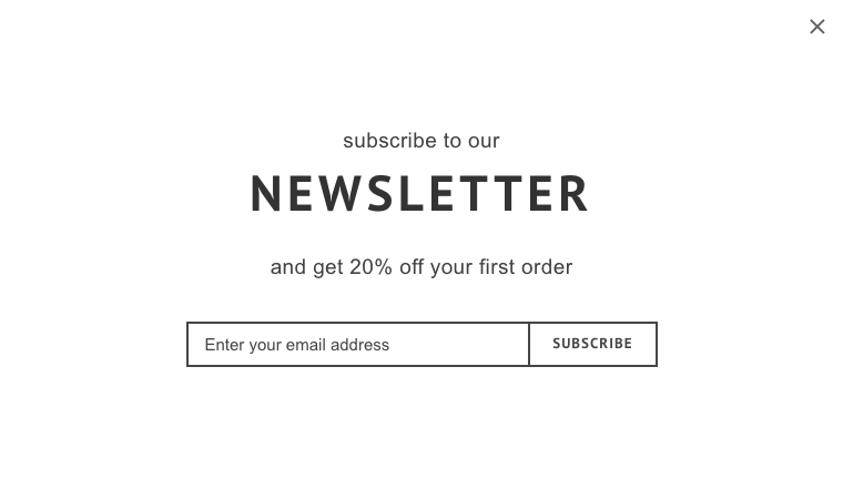
subscribe to our
NEWSLETTER
and get 20% off your first order
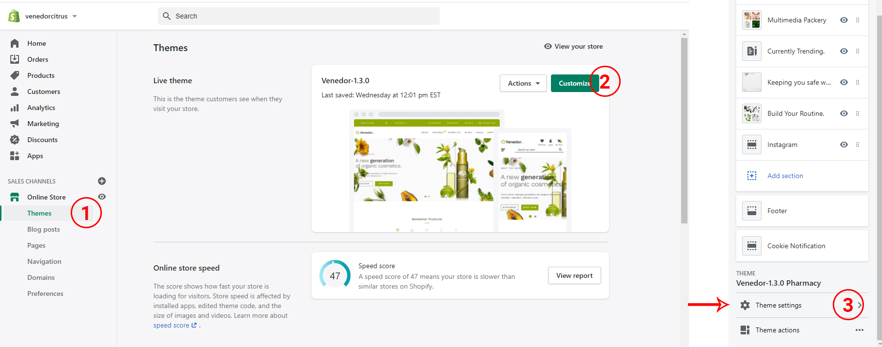
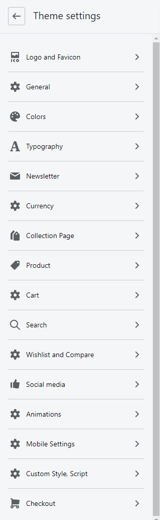
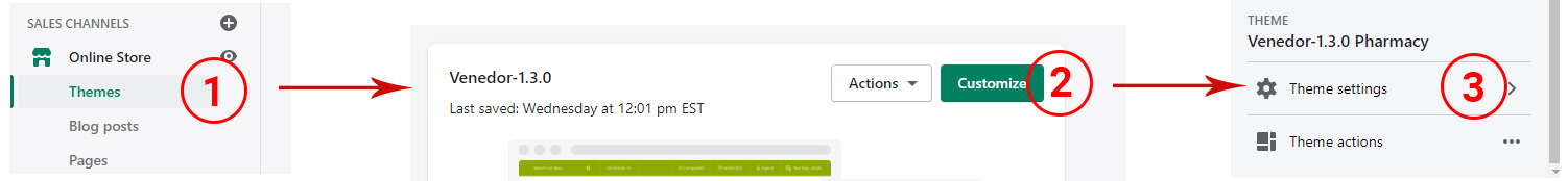
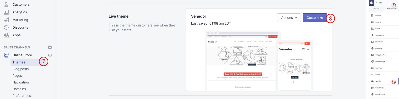
In this section, you will find how to configure the global settings of the theme.

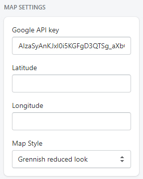
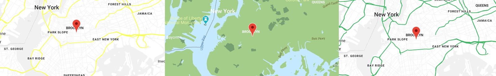
You can set your store location information on google maps. If you are not going to use google maps, you can skip this settings.
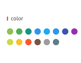
Quick settings for basic colors.
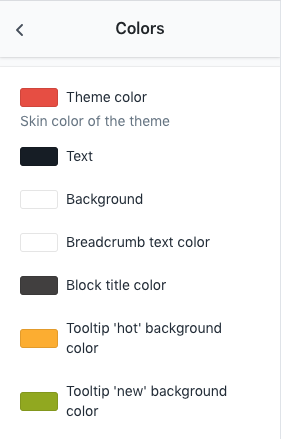
Set theme colors
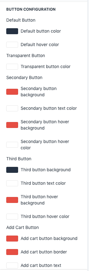
Background and border color of Default button, Transparent button and Add cart button become theme color(defined above setting) when mouse hover. Text color of these tree buttons become Default hover color.
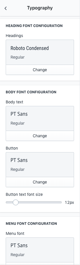
Set headings, body text, buttton and menu fonts.
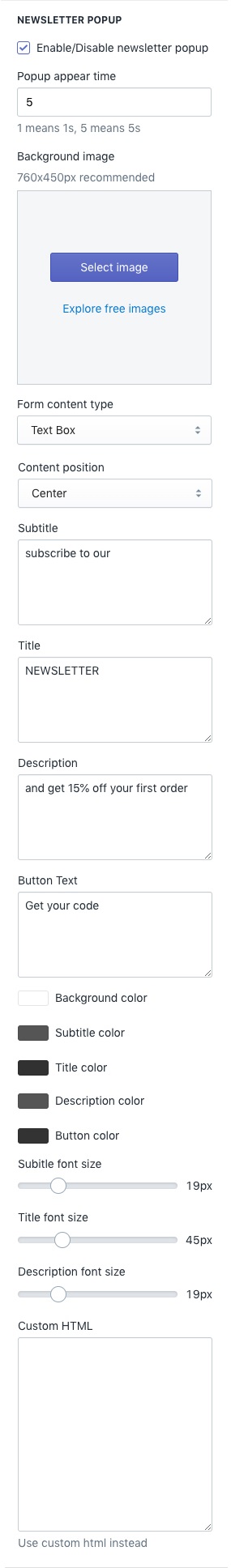
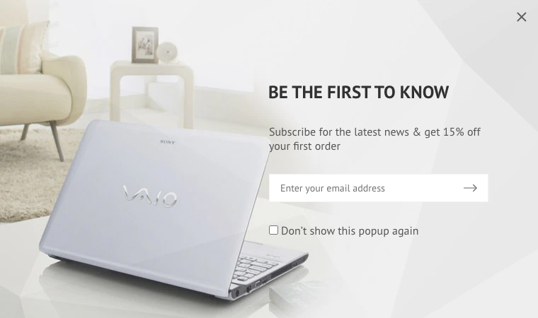
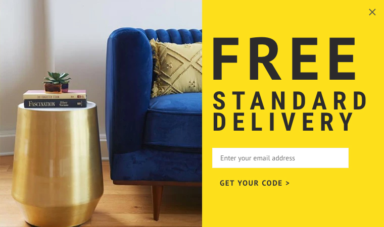
| Newsletter Popup | |
|---|---|
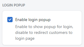
| Enable/Disable newsletter popup | Enable or disable newsletter |
| Popup appear time | Set the popup appear time. 5 or 6 seconds recommended. |
| Background image | Set the background image of newsletter. Recommended size is 760px for width and 450px for height. |
| Form content type | Select form styles.
|
| Content position | Select position of the content:
|
| Subtitle | Set top text |
| Title | Form title |
| Description | Form description |
| Button Text | Input button title |
| Background color | Set background color of the newsletter popup dialog |
| Subtitle color | Set text color of subtitle |
| Title color | Set text color of form title |
| Description color | Set text color of description |
| Button color | Set button color. This only works for free delivery style. |
| Subtitle font size | Set font size of subitle |
| Title font size | Set font size of form title |
| Description font size | Set font size of description |
| Custom HTML | Set custom HTML. This only works when Form content type is set to Custom HTML |
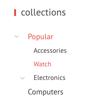
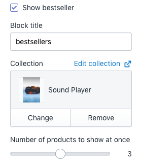
See official documentation about collections.
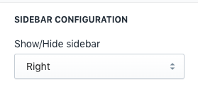
Show/Hide sidebar: Set sidebar position - right or left. Sidebar can be disabled by setting this option to hide
This setting allows to show a products carousel on the sidebar only in collections list page. It is not showing on collection details pages.
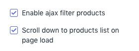
Replace the collection filtered result without page refresh.
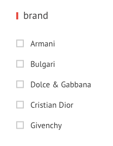
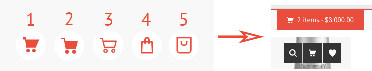
Following images are kinds of collection filters.
Smoothly scrolls down to the main products area.
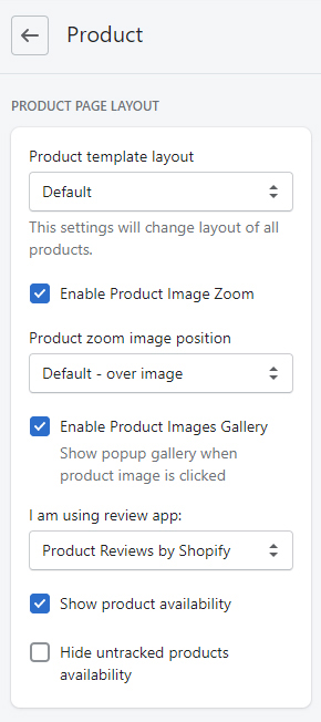
| PRODUCT PAGE LAYOUT | |
|---|---|
| Product template layout | Choose layout of the product details page
You can choose specific products to have certain product layout. See how to do it. |
| Enable product image zoom | Choose layout of the product details page |
| Product zoom image position | Set position of the zoom image |
| I am using review app: | Venedor integrated most popular review apps by default.
If you installed your prefered review app, then choose it from here.
If the app is not listed here, it means the app is not integrated in the theme yet.
Please contact us or app developer in that case.
|
| Show product availability | Show product inventory information |
| Hide untracked products availability |
Hide product availaiblity for untracked products |
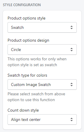
| STYLE CONFIGURATION | |
|---|---|
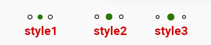
| Product options style | Style of the product swatches
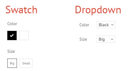
|
| Product options design | Style of the product swatches - Rectangle or Circle. This option only works when product options style is set to swatch. |
| Swatch type for colors | Select color swatch type.
|
| Countdown style | Set style of the time countdown widget. |
| STYLE CONFIGURATION | |
|---|---|
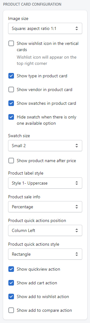
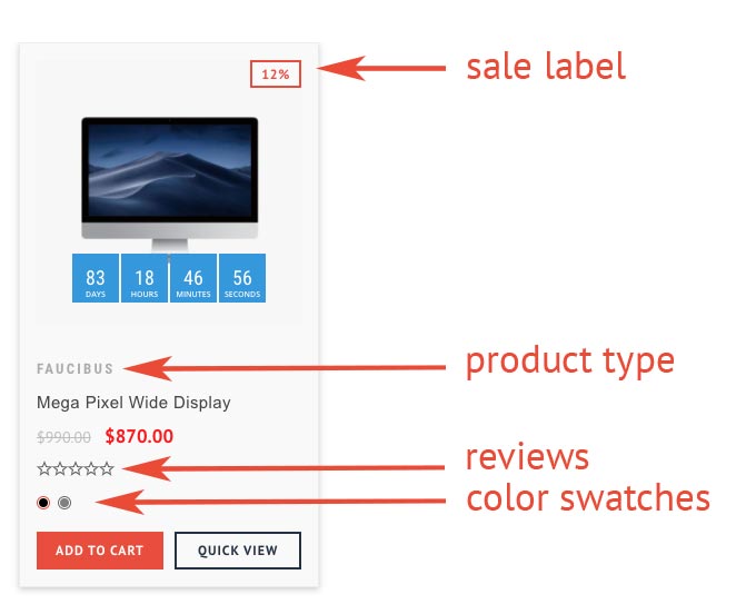
| Image size | Set size of the image to show in the product cards. |
| Show wishlist icon inthe vertical cards | On the top right corner, wishlist button will be added |
| Show product type in the card | Enable to show product type |
| Show vendor in the card | Enable to show product vendor |
| Show swatches in the card | Enable to show color swatches |
| Hide swatch when there is only one available option |
If the product has one available variant, then hide swatch options |
| Swatch size | Set swatch size |
| Show product name after price | Move product name under the product price |
| Product label styel | Control the capitalization of labels |
| Product sale info | Set the sale label type. Show discounted percentage or static text label for sale. |
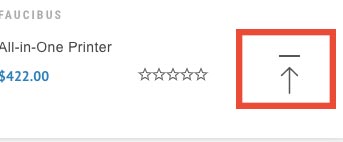
| Product quick actions position | Set the position of quick action buttons. Quick action buttons will appear when you hover on the product cards. |
| Product quick actions style | Set the style of quick action buttons. |
| Show quickview action | Show quickview button in the card |
| Show add cart action | Show add cart button in the card |
| Show add to wishlist action | Show wishlist button in the card |
| Show add to compare action | Show compare button in the card |
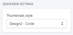
Thumbnails style: Set product image thumbnails of quickview popup
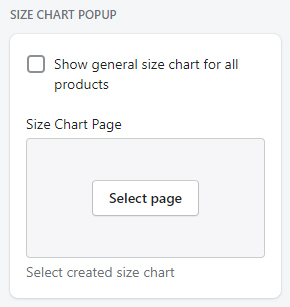
| SIZE CHART POPUP | |
|---|---|
| Show general size chart for all products | Use same size chart for all products |
| Size chart page | Select size chart page. Watch video guide. |
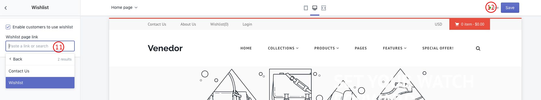
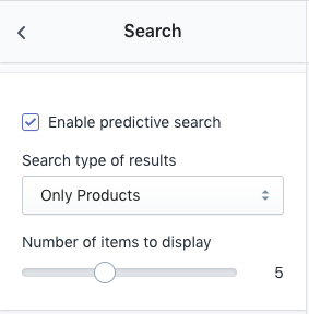
You can skip this section if you are not going to use wishlist options
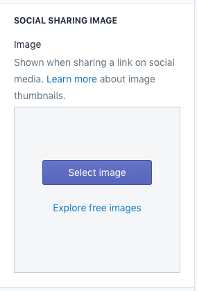
SOCIAL SHARING IMAGE
Image: When you share a link to your online store on social media, such as on Facebook or Pinterest, you can display a thumbnail image in your post
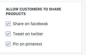
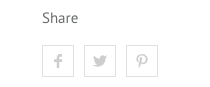
Select social platforms to allow customers share product
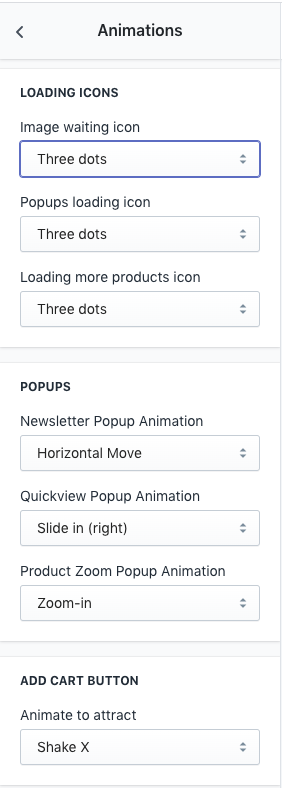
| Loading Icons | |
|---|---|
| Image waiting icon |
Set the SVG animation when loading images.
|
| Popups loading icon | Set animation effect when loading popup dialogs.
|
| Popups | |
|---|---|
| Popup Animations | Set the animation when opening newsletter signup form. Click below links to see the animations: |
| Add Cart Button | |
|---|---|
| Aminate to attract | Set button amination. The actions is repeated every 10 seconds. |
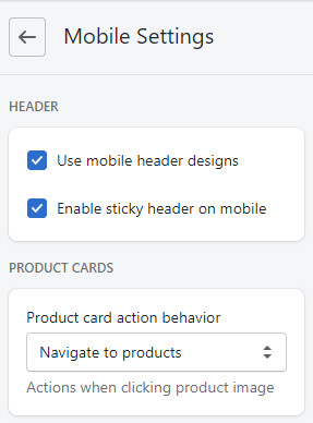
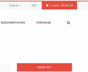
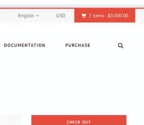
| Header | |
|---|---|
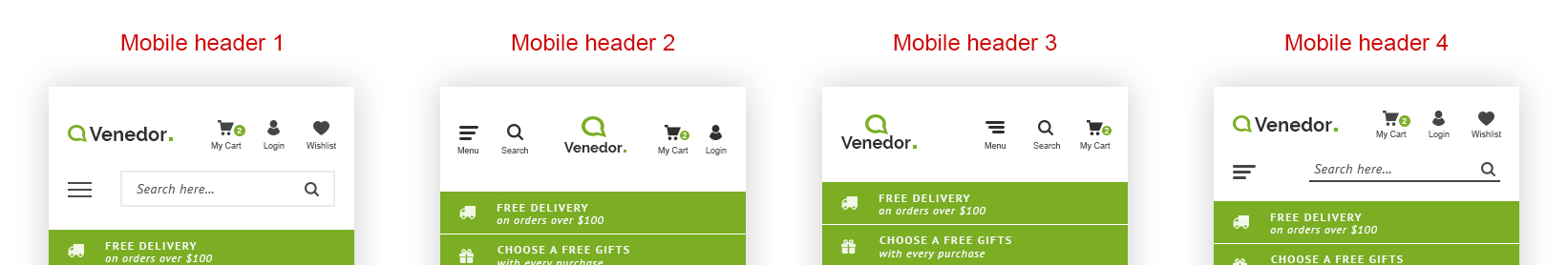
| Use mobile header designs | If this option is enabled, a section called Mobile Header will appear under Header section.Venedor has 4 mobile header styles. Use one of these design.
|
| Enable sticky header on mobile | You can disable/enable sticky header on mobiles. |
| Product Cards | |
|---|---|
| Product card action behavior | You can show quick buttons when user touches product cards. Or let them visit the product details page. |
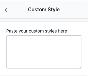
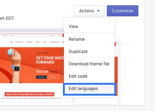
Insert your custom styles here. Custom styles are top priority as they are inserted after all other styles.