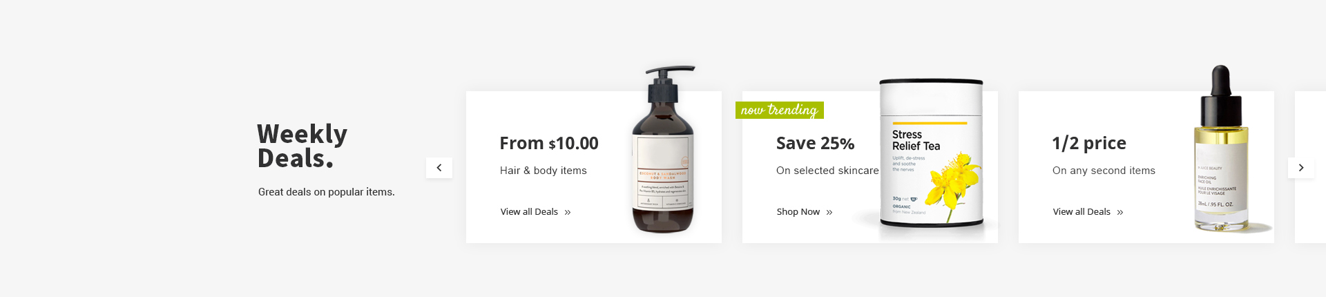
Venedor Section - Text With Image 2

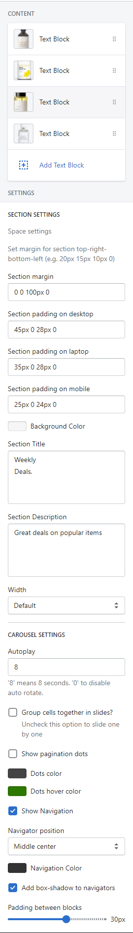
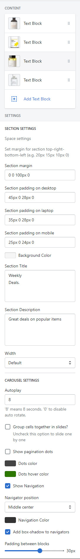
Section settings
Blocks: You can add blocks as many as you want. Click here to go to the block settings.
- Space settings
-
- Section margin: Set space between other sections. Unit is pixel.
- Section padding on desktop: Set padding of the section on desktop. Width > 1400px devices are considered as desktop.
- Section padding on laptops: Set padding of the section on laptop. 1400px > Width > 768px devices are considered as laptop.
- Section padding on mobile: Set padding of the section on mobile. Width < 769xp devices are considered as mobile.
- Section settings
-
- Background color: Set section background.
- Section title: Set title. Line breaks are preserved.
- Section description: Set description. Line breaks are preserved.
- Carousel settings
-
- Autoplay: Set autoplay duration. Unit is second. Input 0 to disable autoplay.
- Group cells together in slides?: Show one by one or group by group.
- Show pagination dots
- Dots color: Set the color of pagination dots.
- Dots hover color: Set color of an active or hovered pgaination dot.
- Show navigation
- Naviagtor position: Choose where to show the navigation buttons.
- Navigation color: Set navigation button color
- Add box-shadow to navigators: This option adds box-shadow effect around navigation buttons.
- Padding between blocks: Set space between blocks.
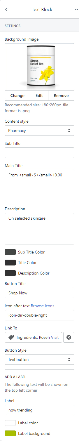
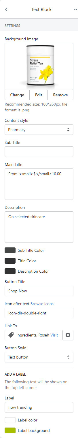
Block settings
-
Settings
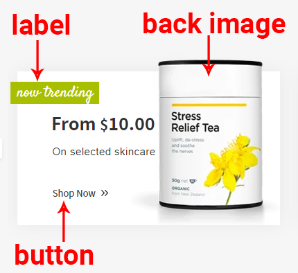
- Background image: Set an image to show on the right side of the block. Recommended format is PNG and dimension is 180px * 260px.
- Content style: Choose one of the text styles from a pre-defined list.
- Set text
- Sub title: Set the top text.
- Main title: Set main title.
- Description: Set description text.
Use <small></small> tag to show a smaller text. In the example at the bottom, there is a smaller text $.
- Text Colors
- Sub title color: Set main title.
- Button
- Button title
- Icon after text: Input an icon name to show in the button. This icon will reside on the right side of the text. Browse icons
- Button link: Set the link of button. You can select a page of your store or copy-paste a URL here.
- Button style: Choose one of the buttons defined in the theme settings.
-
ADD A LABEL
- Label: Set label text
- Label color: Set text color
- Label background: Set background color
-
Example block