Venedor Section - Multimedia Packery
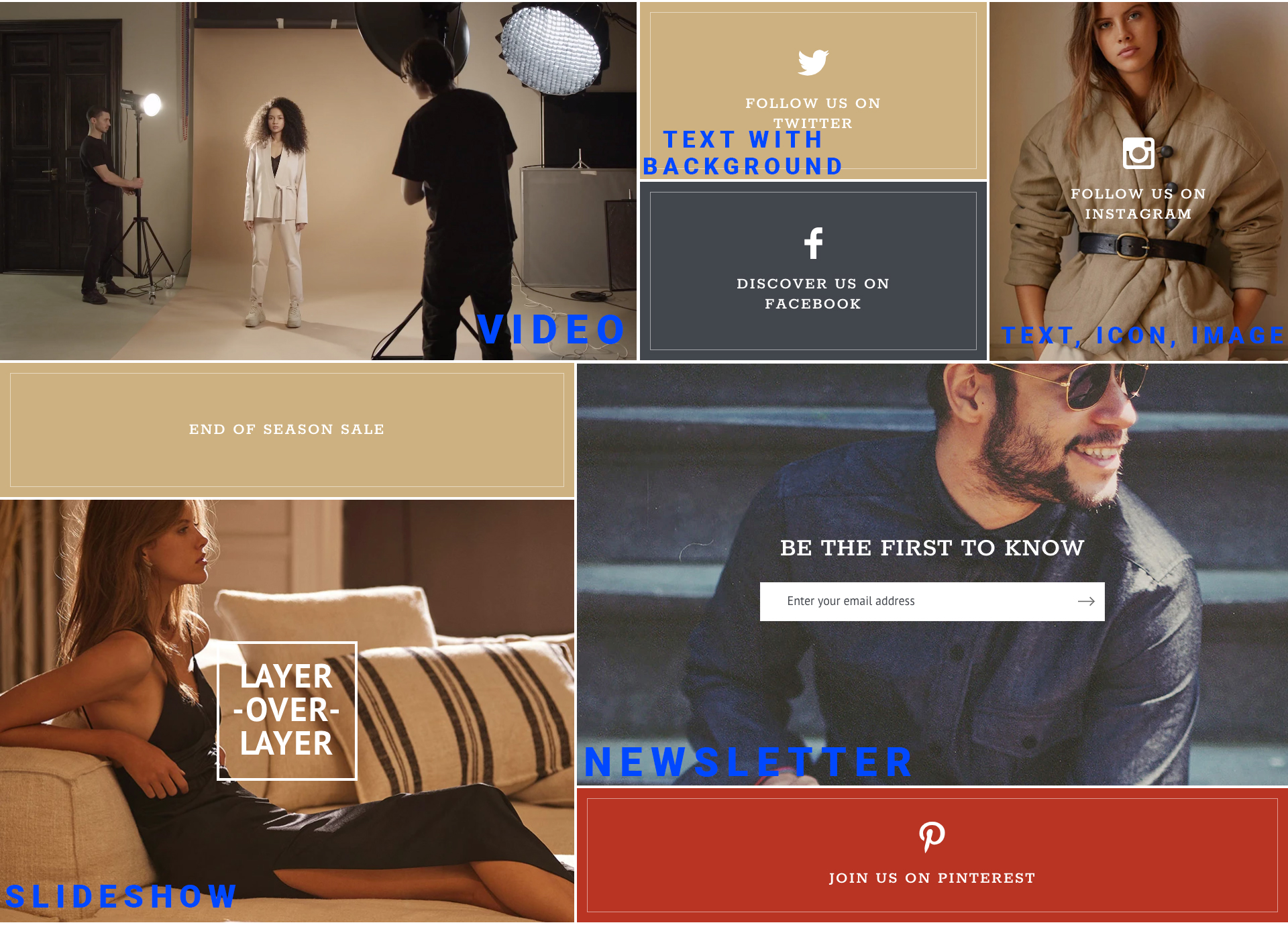
Available block contents:
Section settings
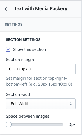
- Show this section: Show/Hide section
- Section margin: Space between other sections. Order is top-right-bottom-left.
- Section width: Set full width or fixed width
- Space between images: Set space between blocks. Unit is pixel.
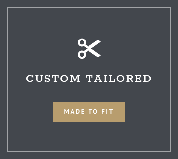
Text and background
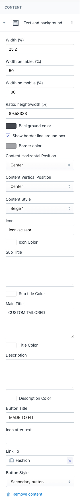
- Width(%): Set percentage of width of container
- Width on tablet(%): Set percentage of width on tablet. Default is 50%.
- Width on mobile(%): Set percentage of width on mobile. Default is 100%.
- Ratio: height/width(%): Set area ratio. It is calculated by dividing heigth with width. For example if you want to show 800px*600px area on desktop, set this ratio to 0.75
- Background color: Set block background color.
- Show border line around box: Add a squre line inside the box.
- Border color: Set color of the line inside box.
- Content Horizontal Position: Set horizontal position of the content.
- Content Vertical Position: Set vertical position of the content.
- Content Style: Set one of the pre-defined content styles.
- Icon: Set icon name to show the icon at the top of content.
- Icon Color: Set color of icon.
- Sub Title: Set sub title.
- Sub title color: Set text color of sub title.
- Main Title: Set the main title.
- Title Color: Set color of the main title.
- Description: Set description text.
- Description Color: Set text color of description.
- Button Title: Set title of button. If this field is blank, no button is created.
- Icon after text: Shows an svg icon after the button title.
- Link To: Set the button link. If button title is empty but this link is set, then entire block is clickable to this link.
- Button Style: Set the style of button defined in the theme.
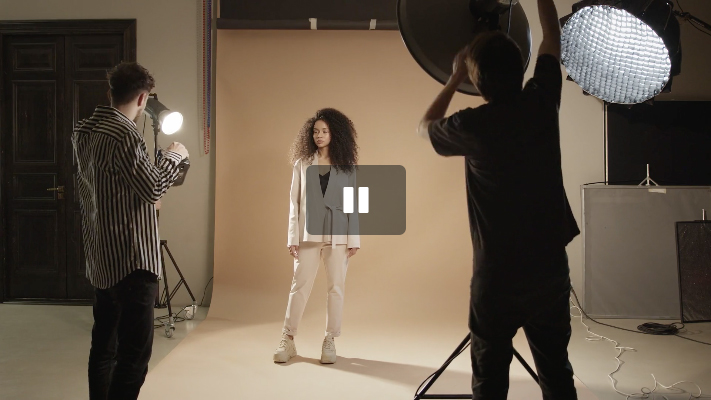
Video
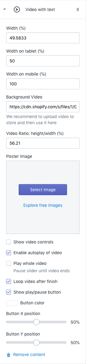
- Width(%): Set percentage of width of container
- Width on tablet(%): Set percentage of width on tablet. Default is 50%.
- Width on mobile(%): Set percentage of width on mobile. Default is 100%.
- Background Video: Set url of the background video. You can use youtube and vimeo url here. We recommend to upload your video to your shopify store and use it here.
- Video Ratio: height/width (%): Set video ratio. It is calculated by dividing heigth with width. For example if your video is 16:9, then set this ratio to 56.25
- Poster Image: Specifies an image to be shown while the video is downloading, or until the user hits the play button. If this is not included, the first frame of the video will be used instead.
- Show video controls: Show video controls - play/pause, time tracker etc...
- Enable autoplay of video: Autoplays video as soon as page is rendered.
- Play whole video: Slider is not switched until whole video finishes
- Loop video after finish: Loop video after it finishes.
- Show play/pause button: Show play/pause button. When autoplay is enabled, video will be autoplayed when customers visits store but without sound.
- Button color: Set color of play/pause button
- Button X position: Absolute % position of horizontal
- Button Y position: Absolute % position of vertical
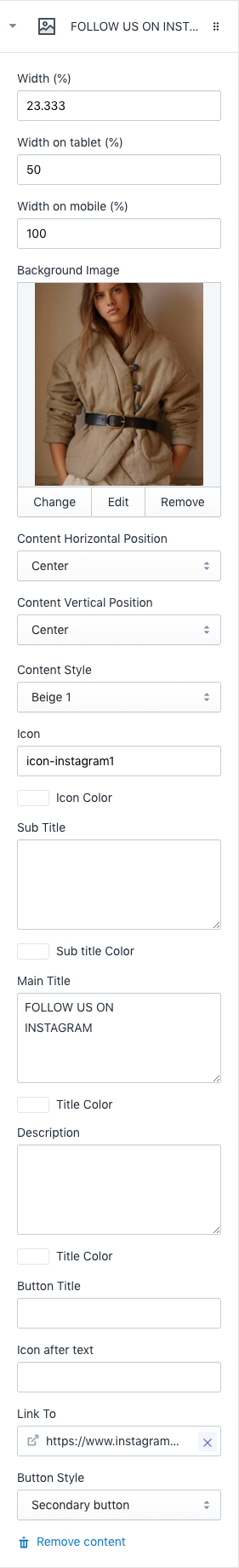
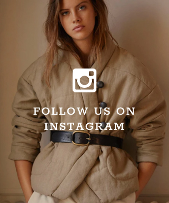
Icon, Text, Image
- Width(%): Set percentage of width of container
- Width on tablet(%): Set percentage of width on tablet. Default is 50%.
- Width on mobile(%): Set percentage of width on mobile. Default is 100%.
- Background Image: Set background image of the block. Image height is automatically calcualted with the aspect ratio of the image (Venedor automatically calculates this part so you only need to set proper width).
- Content Horizontal Position: Set horizontal position of the content.
- Content Vertical Position: Set vertical position of the content.
- Content Style: Set one of the pre-defined content styles.
- Icon: Set icon name to show the icon at the top of content.
- Icon Color: Set color of icon.
- Sub Title: Set sub title.
- Sub title color: Set text color of sub title.
- Main Title: Set the main title.
- Title Color: Set color of the main title.
- Description: Set description text.
- Description Color: Set text color of description.
- Button Title: Set title of button. If this field is blank, no button is created.
- Icon after text: Shows an svg icon after the button title.
- Link To: Set the button link. If button title is empty but this link is set, then entire block is clickable to this link.
- Button Style: Set the style of button defined in the theme.
Slideshow
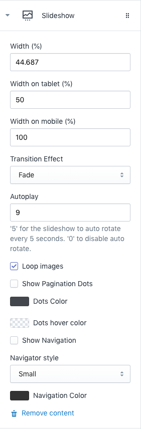
This block is for slideshow settings. Slideshow content blocks should be added after this block.
- Width(%): Set percentage of width of container
- Width on tablet(%): Set percentage of width on tablet. Default is 50%.
- Width on mobile(%): Set percentage of width on mobile. Default is 100%.
- Transition Effect: Choose effect of sldie transition ( slide effect and fade effect ).
- Autoplay: Autoplay speed of slider. 5 means slider autoplays every 5 seconds. Input 0 to disable autoplay
- Loop images: Slider loops infinitely
- Show Pagination Dots: Creates and enables page dots.
- Dots color: Set dot color
- Dots hover color: Set color of active dot and mouse hovered dot.
- Show Navigation: Creates and enables previous & next buttons
- Navigator style: Set navigator style. Big or small.
- Navigation color: Set navigator color
Slideshow Content
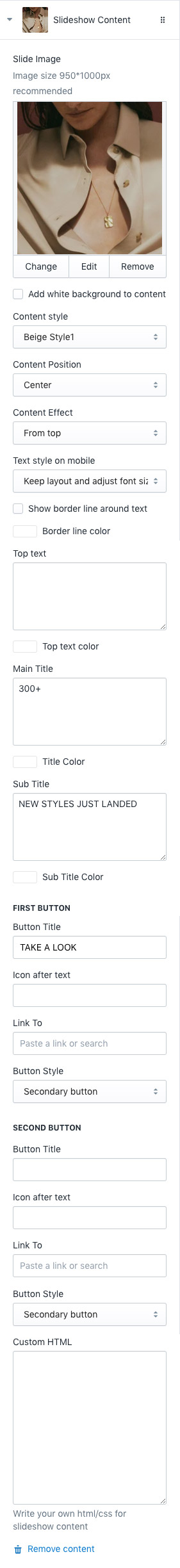
This block is for slideshow contents. Slideshow content blocks should be added after slideshow settings block(refer block above).
- Slide Image: Choose background image of slide
- Add white background to content: Add blurred white background color to the content
- Content style: Choose one of pre-defined text styles
- Content Position: Set where to show the content
- Content Effect: Set appearing animation of content
- Text style on mobile: Choose text styles to show on mobile devices
- Show border line around text: Add a border box arond text area
- Border line color: Set the border box color
- Top text: Input text to show at the top
- Top text color: Set top text color
- Main title: Set main text of the slide
- Title color: Set color of main title
- Sub Title: Set sub title which comes under main title
- Sub Title Color: Set sub title color
You can add up to 2 buttons in each slide
First Button- Button Title: Set title of button
- Link To: Set the button link. If first button title and second button title are empty but this link is set, then entire block is clickable to this link.
- Icon after text: Set the svg icon name to show after text
- Button Style: Set style of button defined in color settings. See configuring button colors here.
- Button Title: Set title of button
- Icon after text: Set the svg icon name to show after text
- Link To: Set the button link
- Button Style: Set style of button defined in color settings. See configuring button colors here.
You have to set Content Style to Custom HTML in order to change content using custom HTML
Newsletter
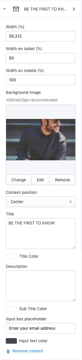
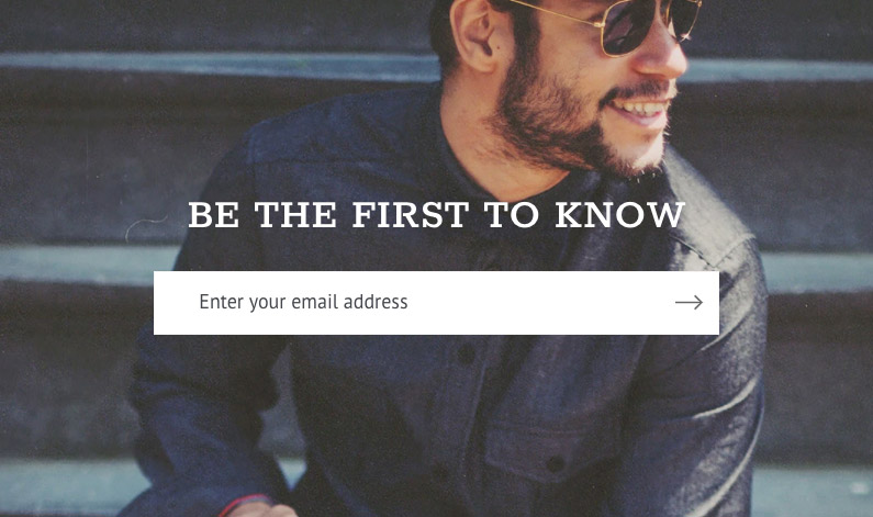
- Width(%): Set percentage of width of container
- Width on tablet(%): Set percentage of width on tablet. Default is 50%.
- Width on mobile(%): Set percentage of width on mobile. Default is 100%.
- Background Image: Set background image of the block. Image height is automatically calcualted with the aspect ratio of the image (Venedor automatically calculates this part so you only need to set proper width).
- Content Position: Set where to show the content
- Title: Set title of newsletter block
- Title color: Set text color of title
- Description: Set descrition text that comes after title
- Description Color: Description color
- Input box placeholder: Set placeholder text of input box
- Input text color: Set input box text color