Venedor Section - Collections Tab
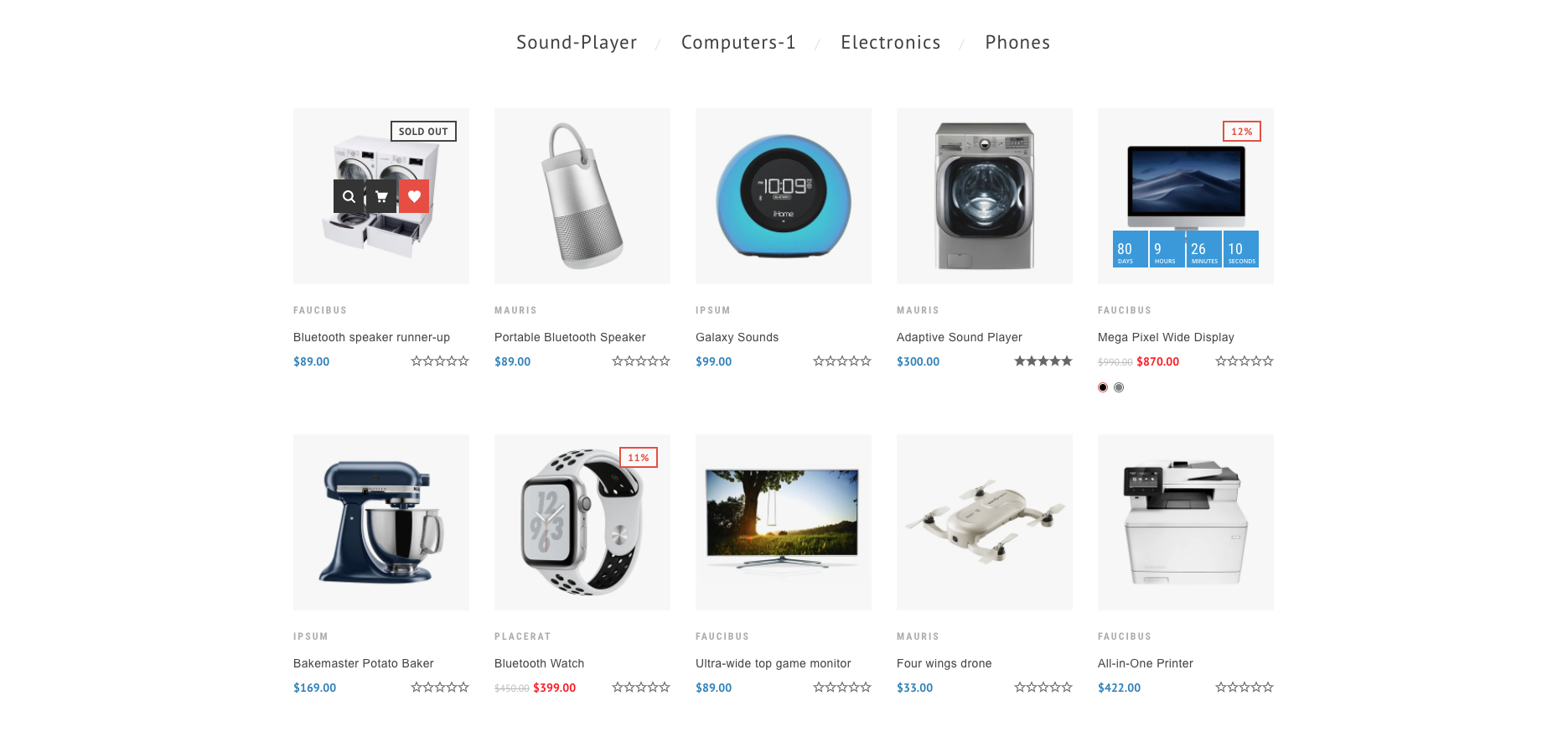
- Section Margin: Space between other sections. Order is top-right-bottom-left
- Section Title: Title of this section
- Tab title font style: Normal or italic
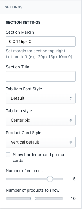
- Tab title style: Left small, Center big, Center with icon
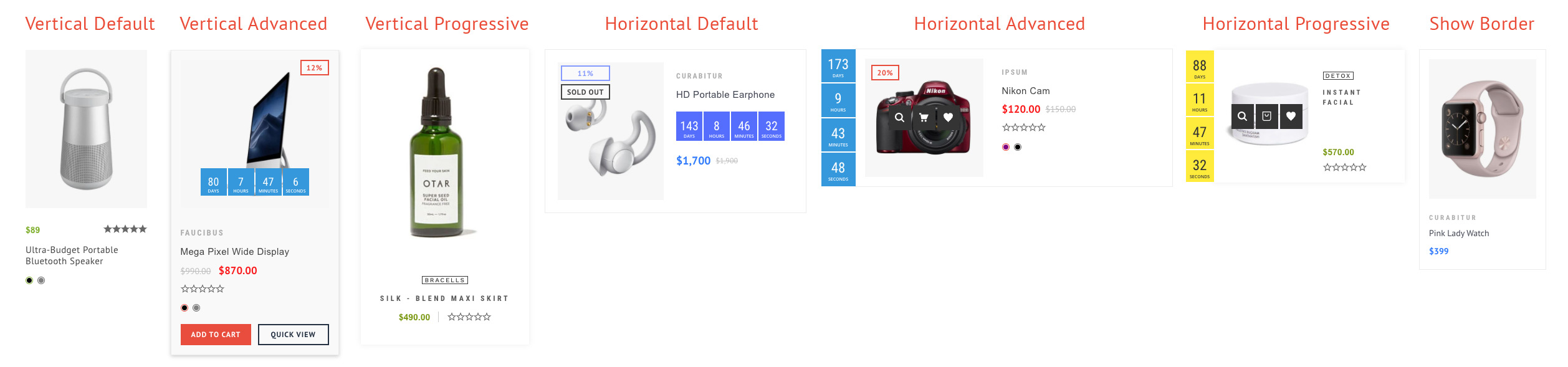
- Product card style: Venedor has 6 kinds of product card styles. Choose one of them.
- Show border around product cards: Add border to product card
- Number of columns
- Number of products to show: Total number of products to show in the grid
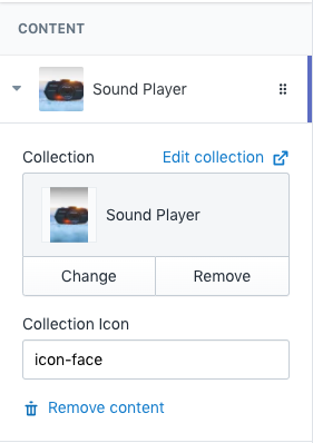
- Collection: Add collection
- Collection icon: Icon to show with collection name. Browse our icons
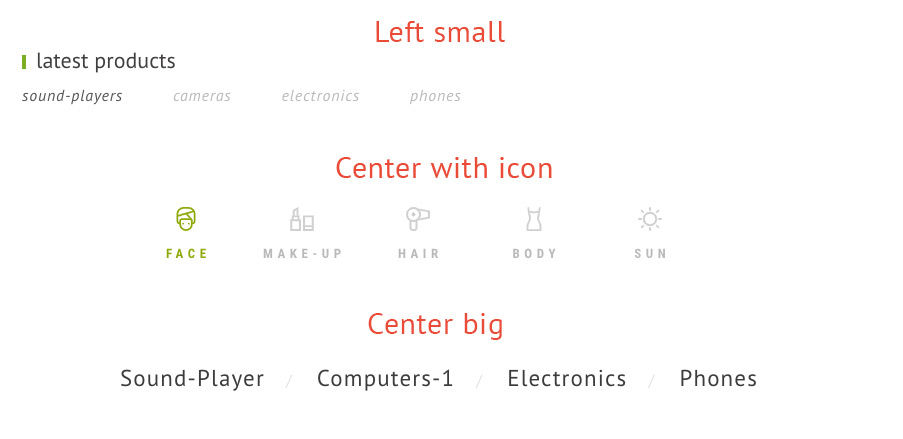
Collection icon: This only works when Tab title style is set to Center with icon in above setting.