Venedor Section - Parallax slider
General settings
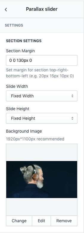
- Section margin: Space between other sections. Order is top-right-bottom-left.
- Slide width: Set width of the section.
- Slide height: Set height of the section.
- Background Image: Set background image of slider
Image size recommendation:
- Full width: 1920px
- Fixed width: 1200px
- Full height: 1100px
- Fixed height: 500px
Lookbook settings
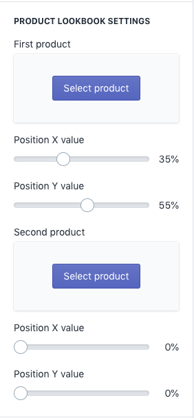
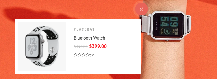
Product lookbooks can be added up to 2 products.
- First product: Select product to add as a lookbook
- Position X value: Set X position of lookbook spot
- Position Y value: Set Y position of lookbook spot
- Second productSelect product to add as a lookbook
- Position X value: Set X position of lookbook spot
- Position Y value: Set Y position of lookbook spot
Carousel settings
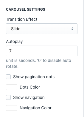
- Transition Effect: Choose effect of slide transition ( slide effect and fade effect ).
- Autoplay: Set auto rotate speed of carousel. Input 6 to autoplay every 6 seconds. Input 0 to disable autoplay.
- Show Pagination Dots: Creates and enables page dots.
- Dots color: Set dot color
- Show Navigation: Creates and enables previous & next buttons
- Navigation color: Set navigator color
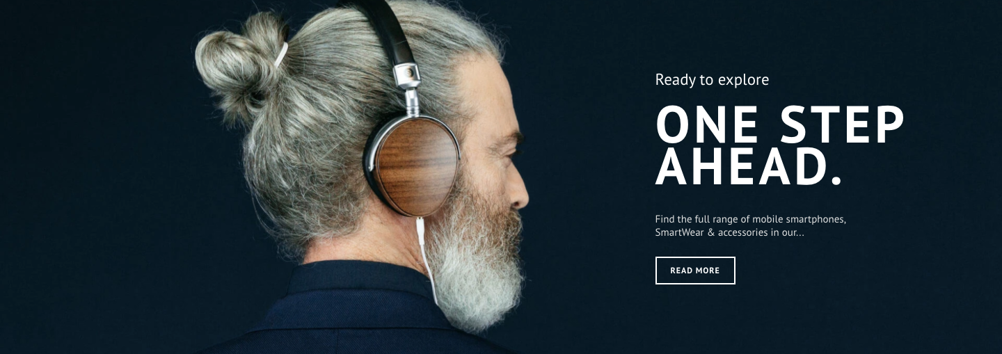
Content Setting
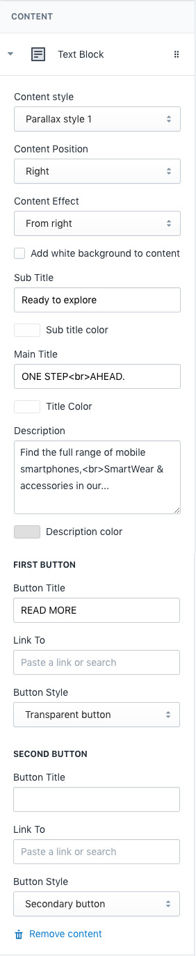
- Content style: Choose one of pre-defined text styles
- Content Position: Set where to show the content
- Content Effect: Set appearing animation of content
- Add white background to content: Add blurred white background color to the content
- Sub title: Top text
- Sub title color: Top text color
- Main title: Main text
- Title color: Set color of main title
- Description: Description
- Description color: Set color of description
You can add up to 2 buttons in each slide
First Button- Button Title: Set title of button
- Link To: Set the button link
- Button Style: Set style of button defined in color settings. See configuring button colors here.
- Button Title: Set title of button
- Link To: Set the button link
- Button Style: Set style of button defined in color settings. See configuring button colors here.