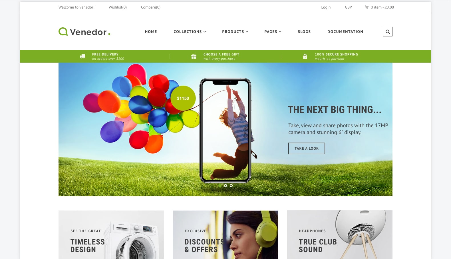
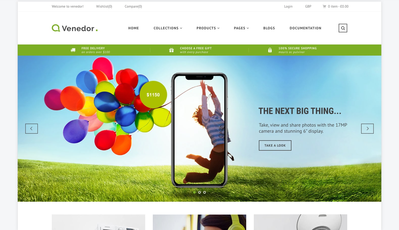
Venedor Section - Slideshow
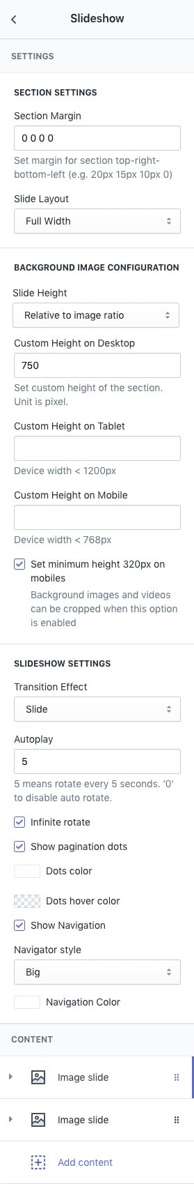
| SECTION SETTINGS | |
|---|---|
| Section Margin | Space between other sections. Order is top-right-bottom-left. |
| Slide Layout | Set section width.
View Examples
|
| BACKGROUND IMAGE CONFIGURATION | |
|---|---|
| Slide Height | Set image height:
|
| Custom Height on Desktop | Set custom height for desktop. This option will work when above option(Slide Height) is set to Custom Height. Unit is pixel. |
| Custom Height on Tablet | Set custom height for Tablet. If this option is empty, then Custom Height on Desktop value will be used for tablet. |
| Custom Height on Mobile | Set custom height for Mobile. If this option is empty, then Custom Height on Tablet value will be used for mobile. |
| Set minimum height 320px on mobiles | Set minimum height on mobiles. This option is useful when text content overflows background image |
| SLIDESHOW SETTINGS | |
|---|---|
| Transition Effect | Choose effect of sldie transition effects that occur when you move from one slide to the next.
|
| Autoplay | Autoplay speed of slider. 5 means slider autoplays every 5 seconds. Input 0 to disable autoplay. Auto-playing will pause when mouse is hovered over, and resume when mouse is hovered off. Auto-playing will stop when the carousel is clicked or a cell is selected. |
| Infinite rotate | At the end of slides, wrap-around to the other end for infinite rotate |
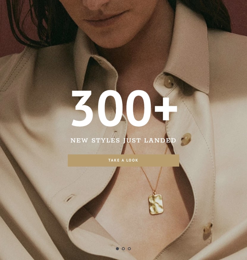
| Show pagination dots | Creates and enables page dots. |
| Dots color | Set pagniation dots color. |
| Dots hover color | Set color of active or hovered dots. |
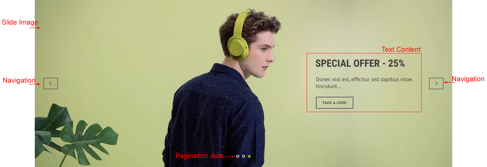
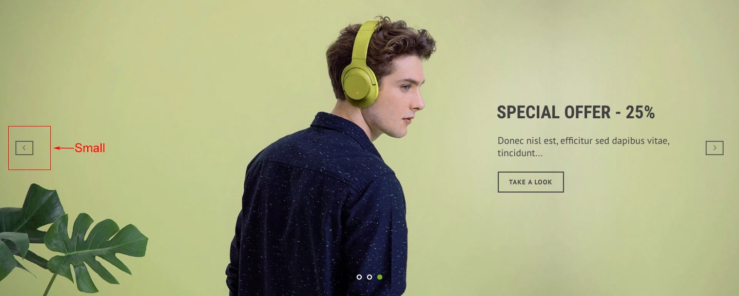
| Show Navigation | Creates and enables previous & next buttons. |
| Navigator style | Set style of navigator.
View Examples
|
| Navigation color | Set color of previous & next buttons. |

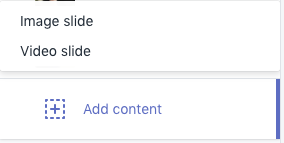
You can add image slide or video slide. Both have same configuration except vdeo slide has additional configuration for video.
Image Slide
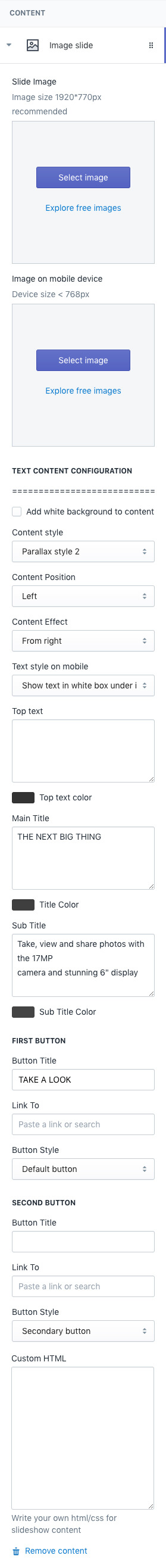
| IMAGE SETTINGS | |
|---|---|
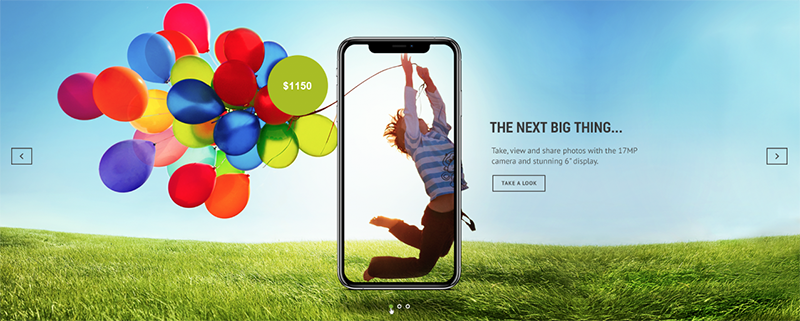
| Slide Image | Choose background image of slide |
| Image on mobile device | Choose background image of slide to show on mobiles(device width is smaller than 768px). If this option is empty, above image is used on mobiles. |
| TEXT CONTENT SETTINGS | |
|---|---|
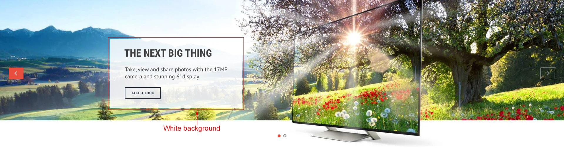
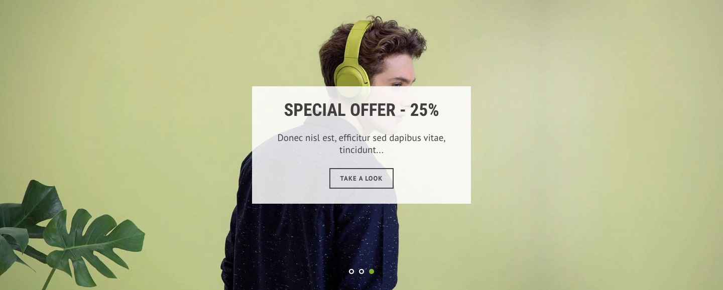
| Add white background to content | Add blurred white background color to the content View Examples |
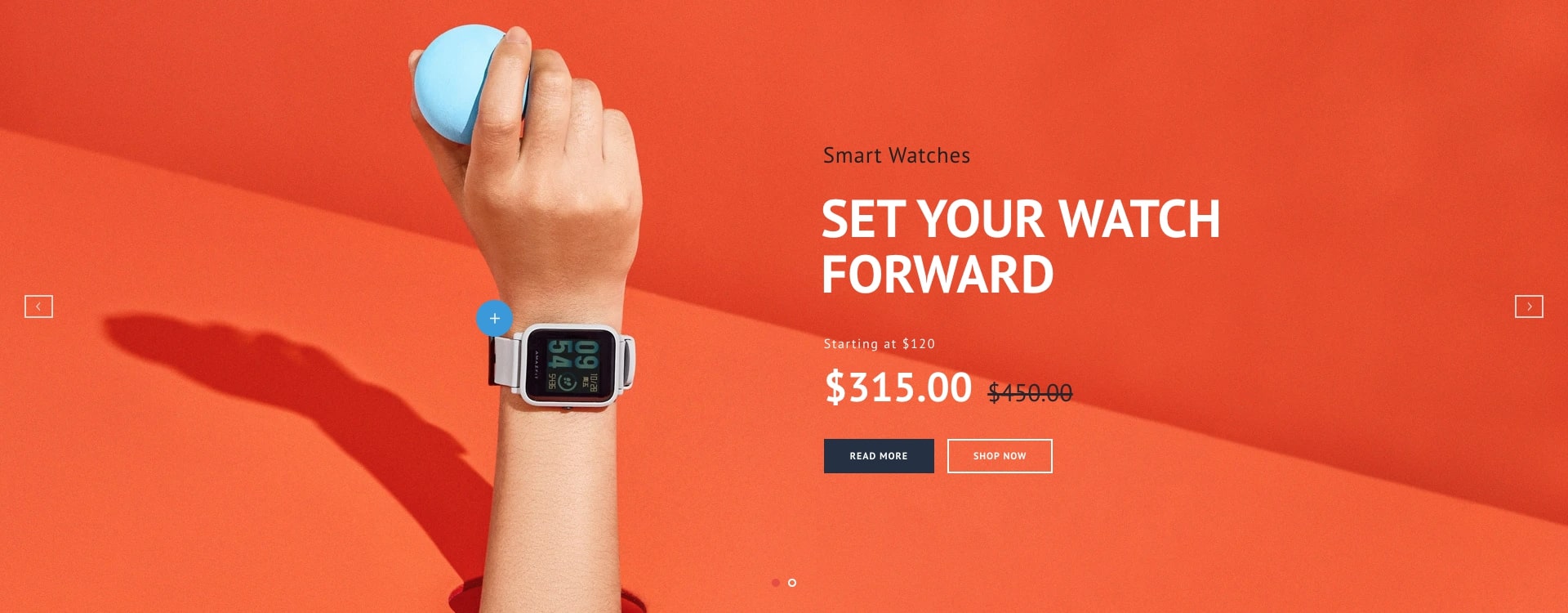
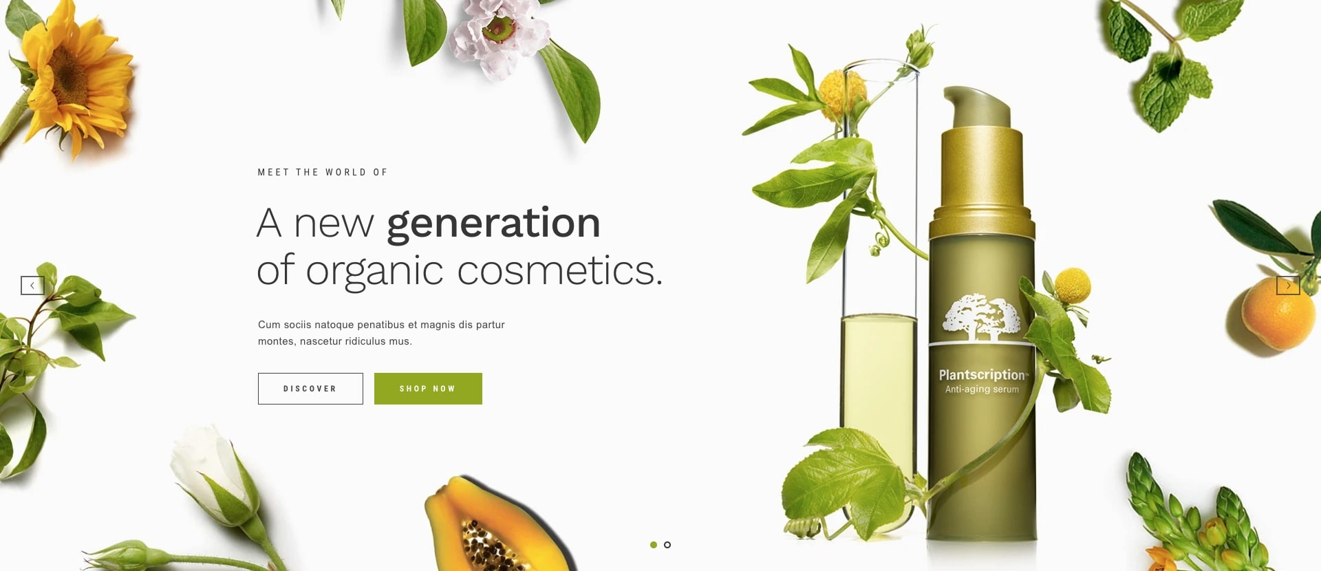
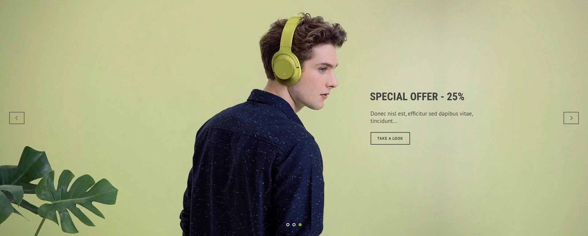
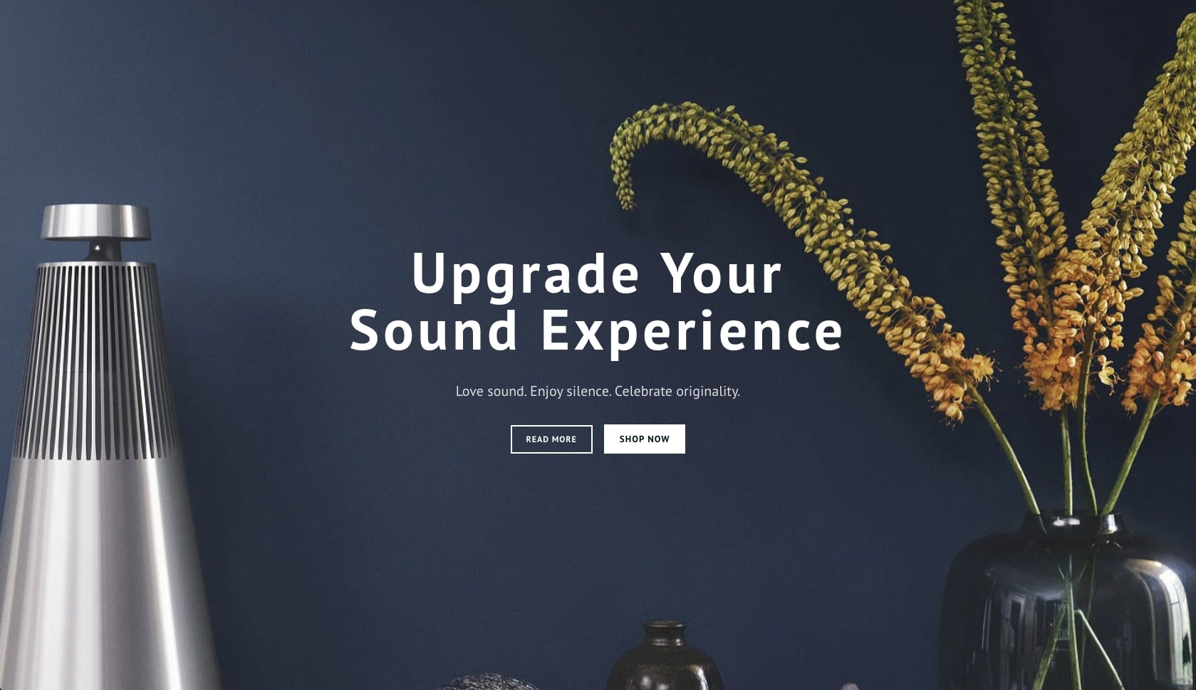
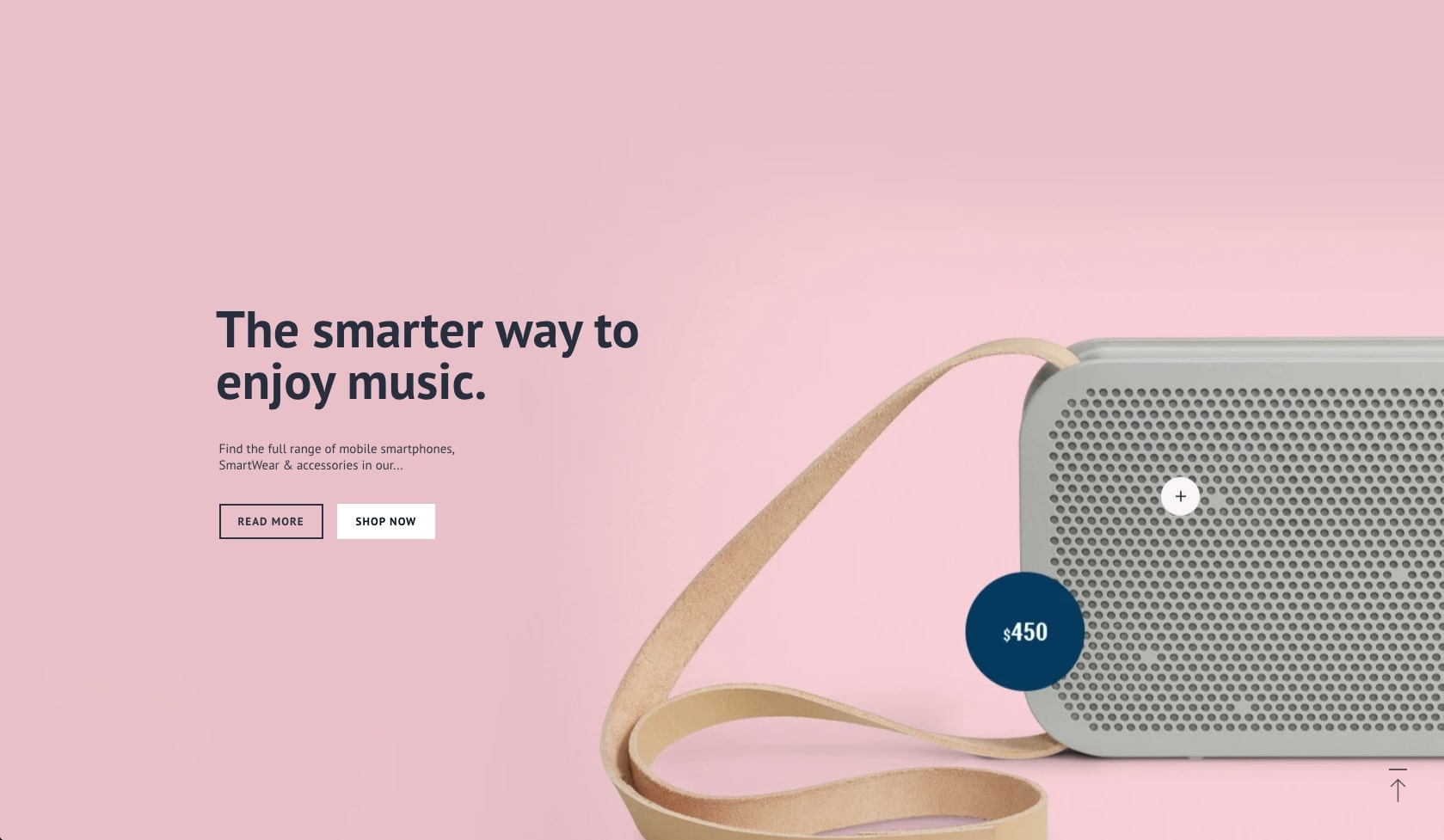
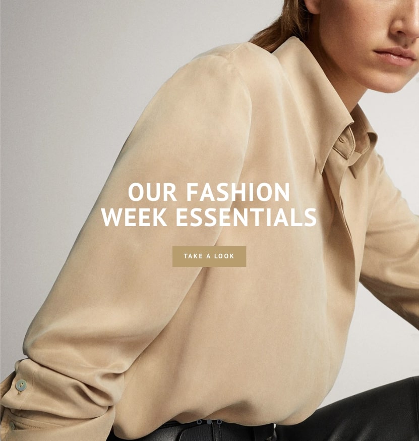
| Content Style | Choose one of pre-defined text styles
View Examples
|
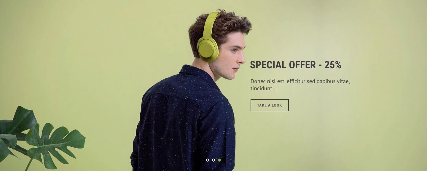
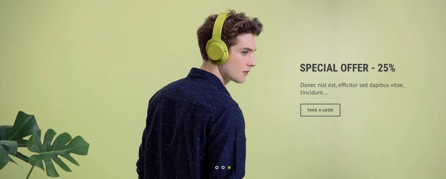
| Content Position | Set where to show the content
View Examples
|
| Content Effect | Set appearing animation of content when moving slide from one to another
|
| Text style on mobile | Choose text styles to show on mobile devices
|
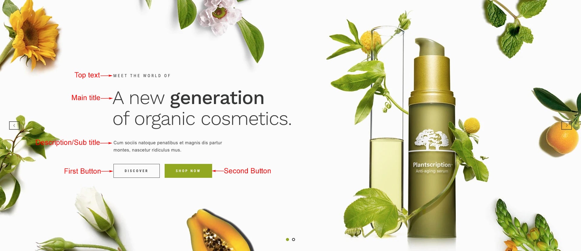
| Top text | Set top text of the content Structure |
| Top text color | Set top text color |
| Main title | Set main text of the content |
| Title color | Set main title color |
| Sub Title | Set sub title of the content |
| Sub Title Color | Set sub title color |
You can add up to 2 buttons in each slide
| FIRST BUTTON | |
|---|---|
| Button Title | Set title of button |
| Link To | Set the button link |
| Button Style | Set style of button defined in color settings. See configuring button colors here. |
| SECOND BUTTON | |
|---|---|
| Button Title | Set title of button |
| Link To | Set the button link |
| Button Style | Set style of button defined in color settings. See configuring button colors here. |
You have to set Content Style to Custom HTML in order to change content using custom HTML


Video Slide
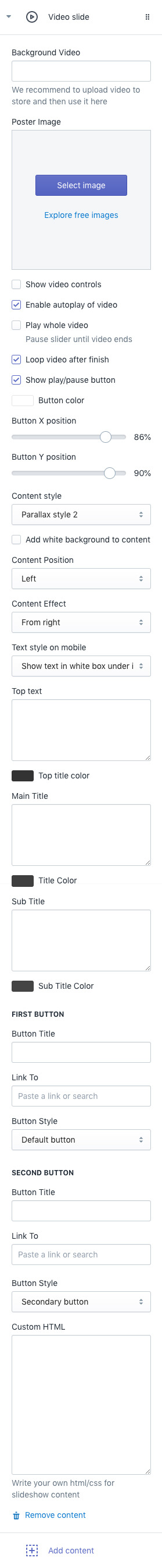
| VIDEO SETTINGS | |
|---|---|
| Background Video | Input video url to use as background. We recommend to upload video to your store and then copy it to here. Go to Store Admin > Settings > Files. Upload video there and then copy URL and then paste it to here. |
| Poster Image | Specifies an image to be shown while the video is downloading, or until the user hits the play button. If this is not included, the first frame of the video will be used instead. |
| Show video controls | Show video controls - play/pause, time tracker etc... |
| Enable autoplay of video | Autoplays video as soon as page is rendered. |
| Play whole video | Slider is not switched until whole video finishes |
| Loop video after finish | Loop video after it finishes. |
| Show play/pause button | Show play/pause button. When autoplay is enabled, video will be autoplayed when customers visits store but without sound. |
| Button color | Set color of play/pause button |
| Button X position | Absolute % horizontal position |
| Button Y position | Absolute % of vertical position |
| TEXT CONTENT SETTINGS | |
|---|---|
| Add white background to content | Add blurred white background color to the content View Examples |
| Content Style | Choose one of pre-defined text styles
View Examples
|
| Content Position | Set where to show the content
View Examples
|
| Content Effect | Set appearing animation of content when moving slide from one to another
|
| Text style on mobile | Choose text styles to show on mobile devices
|
| Top text | Set top text of the content Structure |
| Top text color | Set top text color |
| Main title | Set main text of the content |
| Title color | Set main title color |
| Sub Title | Set sub title of the content |
| Sub Title Color | Set sub title color |
You can add up to 2 buttons in each slide
| FIRST BUTTON | |
|---|---|
| Button Title | Set title of button |
| Link To | Set the button link |
| Button Style | Set style of button defined in color settings. See configuring button colors here. |
| SECOND BUTTON | |
|---|---|
| Button Title | Set title of button |
| Link To | Set the button link |
| Button Style | Set style of button defined in color settings. See configuring button colors here. |