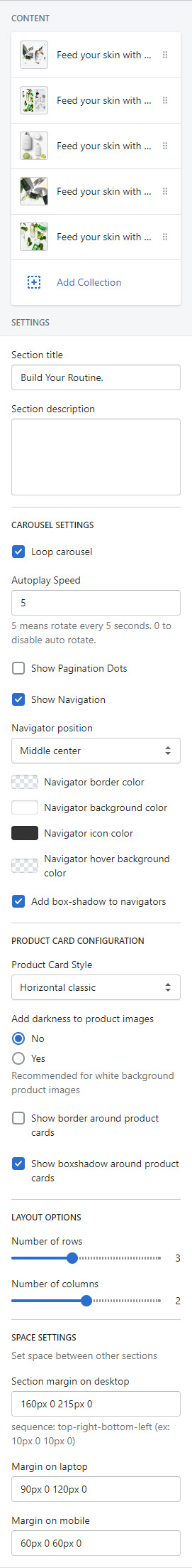
Venedor Section - Products Masonry Carousel
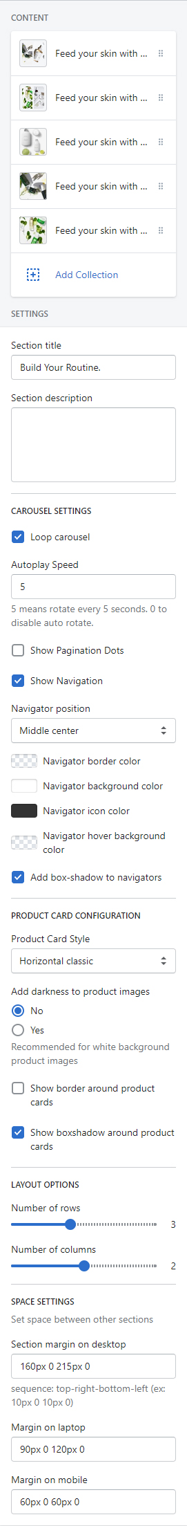
Section settings
Blocks: You can add blocks as many as you want. Click here to go to the block settings.
- Section settings
-
- Section title: Set title
- Section description: Set description. Line breaks are preserved.
- Carousel settings
-
- Loop carousel: At the end of cells, wrap-around to the other end for infinite scrolling.
- Autoplay speed: Set autoplay duration. Unit is second. Input 0 to disable autoplay.
- Show pagination dots
- Show Navigation
- Naviagtor position: Choose where to show the navigation buttons.
- Navigator border color: Set navigation button color
- Navigator background color: Set navigation button color
- Navigator icon color: Set navigation button color
- Navigator hover background color: Set navigation button color
- Add box-shadow to navigators: This option adds box-shadow effect around navigation buttons.
- PRODUCT CARD CONFIGURATION
-
- Product card style: Choose one of the styles from a pre-defined styles list.
- Add darkness to product images: Add a filter effect to product images
- Show border around product cards: Add border
- Show box-shadow around product cards: Add box-shadow effect
- LAYOUT OPTIONS
-
- Number of rows: Set total number of rows
- Number of columns: Set the number of products to show in a row
- Space settings
-
- Section margin on desktop: Set margin of the section on desktop. Width > 1400px devices are considered as desktop.
- Margin on laptops: Set margin of the section on laptop. 1400px > Width > 768px devices are considered as laptop.
- Margin on mobile: Set margin of the section on mobile. Width < 769xp devices are considered as mobile.
Block settings
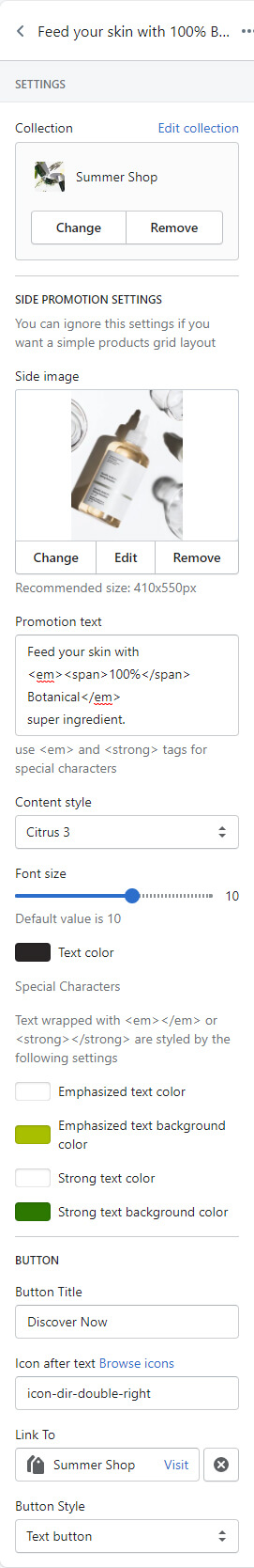
- SETTINGS
-
- Collection: Select one of the collections to show in this block
- SIDE PROMOTION SETTINGS
-
- Side image: Set an image to show on the side promotion area. Recommended format is JPG and dimension is 410px * 550px.
- Set text
- Promotion text: Set the text to show under the image.
- Content style: Choose one of the text styles from a pre-defined list.
- Font size: Set the base font size. This will increase/decrease font size.
- Text color: Set promotion text color.
- Description: Set description text.
Use <em></em> and <strong></strong> tags to show outstanding texts.
Special characters.
- Emphasized text color: Set the color of texts wrapped with <em></em>.
- Emphasized text background color: Set the background-color of texts wrapped with <em></em>.
- Strong text color: Set the color of texts wrapped with <strong></strong>.
- Strong text background color: Set the background-color of texts wrapped with <strong></strong>.
- Button
- Button title
- Icon after text: Input an icon name to show in the button. This icon will reside on the right side of the text. Browse icons
- Button link: Set the link of button. You can select a page of your store or copy-paste a URL here.
- Button style: Choose one of the buttons defined in the theme settings.