Venedor Section - Section with sidebar 2
General Setting
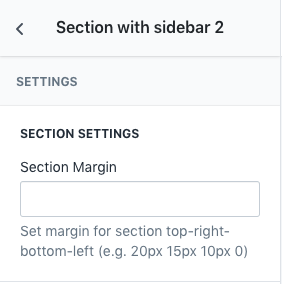
- Section Margin: Space between other sections. Order is top-right-bottom-left.
Sidebar Settings
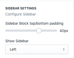
- Sidebar Block top/bottom padding: Space between sidebar blocks
- Show Sidebar: Set position of sidebar. You can hide sidebar if you don't want it.
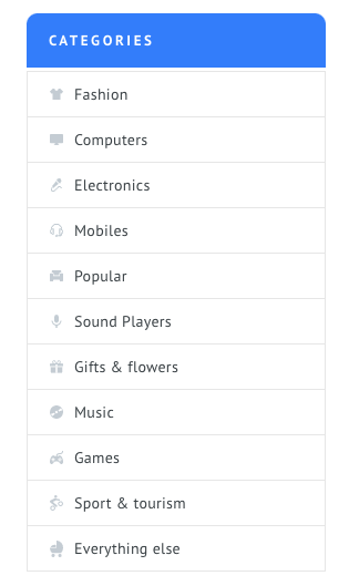
Categories List
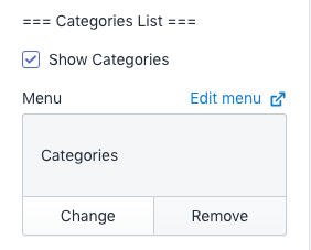
- Show Categories: Show this block from sidebar
- Menu: Select a menu to show navigations
Creating items with icon
- Navigate to Shopify Admin > Navigation > Add menu.
- Input menu title and click Add menu item.
- Input menu item name with icon name. Wrap icon name with square brackets([]). Attach link and click Add. Repeat this action until you fill all items as you need.
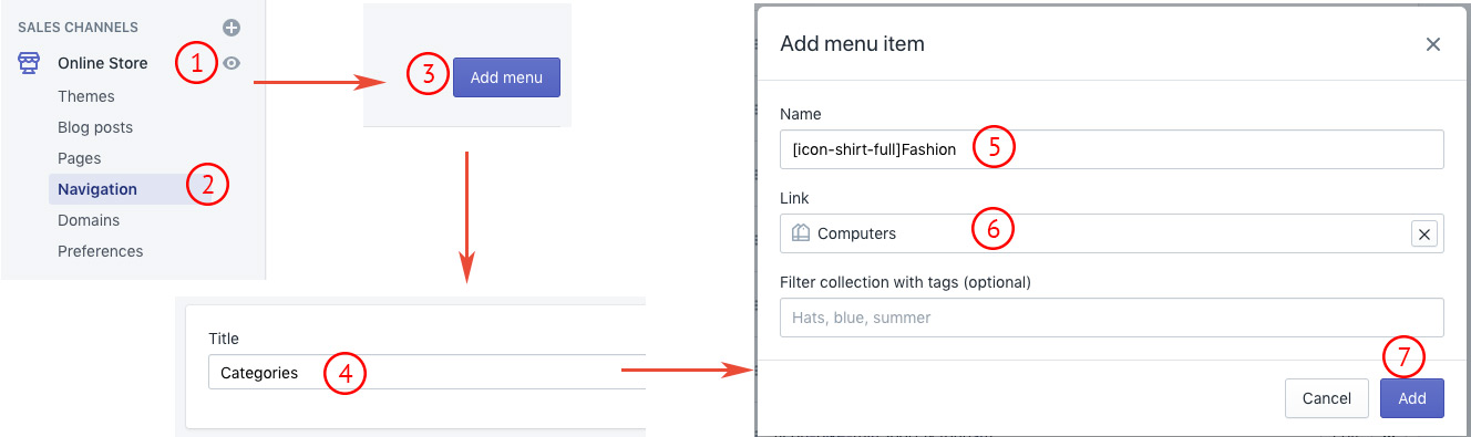
Result:
Shop by brand
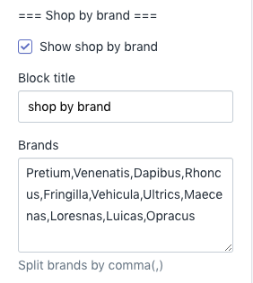
- Show shop by brand: Show this block from sidebar
- Block title: Set block title
- Brands: Input comma seperated brand names to filter with search phrase
Here, brand means product tags. You have to input product tags with comma(,) seperated in order to get correct result.
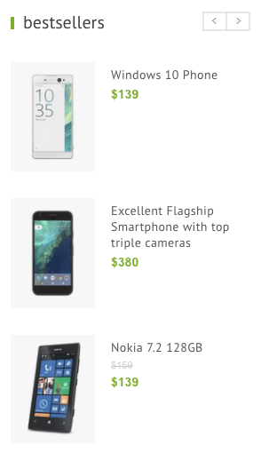
Bestseller
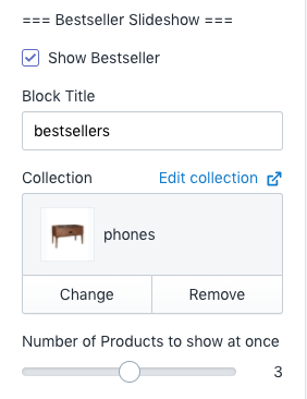
- Bestseller
- Show Bestseller: Show bestseller from sidebar
- Collection: Select bestselling collection
- Number of products to show at once: Set number of products to show in one slide
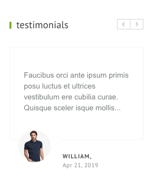
Testimonials
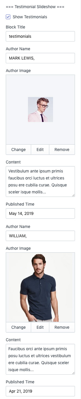
You can add up to 2 testimonials to this block.
- Show Testimonials: Show testimonials block from sidebar
- Block Title: Set block title
- Author Name: Author name of first testimonial
- Author Image: Upload author image of first testimonial
- Content: Input content of first testimonial
- Published Time: Input released time of testimonal
- Author Name: Author name of second testimonial
- Author Image: Upload author image of second testimonial
- Content: Input content of second testimonial
- Published Time: Input released time of testimonal
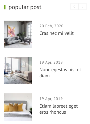
Popular Post Slideshow
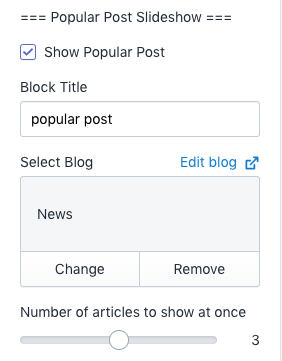
- Show Popular Post: Show popular post block from sidebar
- Block Title: Set block title
- Select Blog: Set blog to show. See Shopify Official Documentation about blogs and articles.
- Number of articles to show at once: Set number of articles to show in one slide
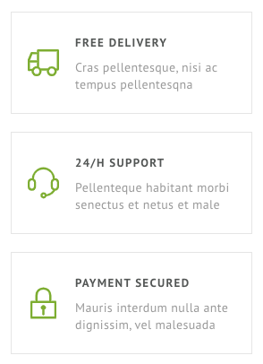
Promotion Text
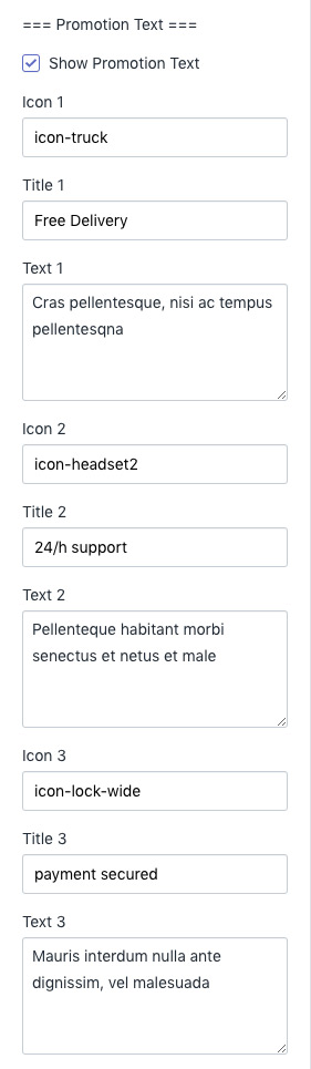
You can add up to 3 promotion items in this block.
- Show Promotion Text: Show promotion block from sidebar
- Icon 1: Icon name of first item. Browse our icons
- Title 1: Set title of first item
- Text 1: Set description text of first item
- Icon 2: Icon name of second item. Browse our icons
- Title 2: Set title of second item
- Text 2: Set description text of second item
- Icon 3: Icon name of third item. Browse our icons
- Title 3: Set title of third item
- Text 3: Set description text of third item
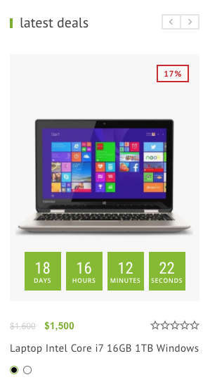
Latest Deals Slideshow
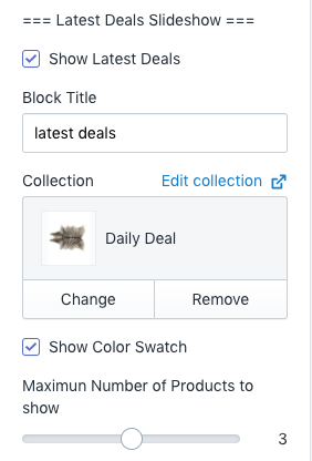
- Show Latest Deals: Show latest deals block from sidebar
- Block Title: Set block title
- Collection: Select collection to show.
- Show Color Swatch: Shows color swatch buttons
- Maximum Number of Products to show: Total number of products to show in this block
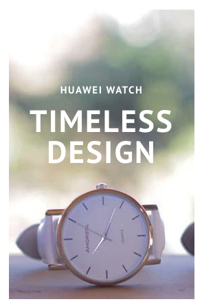
Advertisement Block
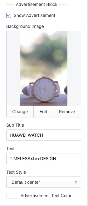
- Show Advertisement: Show advertise block from sidebar
- Sub Title: Set top text
- Text: Set main text
- Text style: Set style of text
- Advertisement Text Color: Set text color of this block
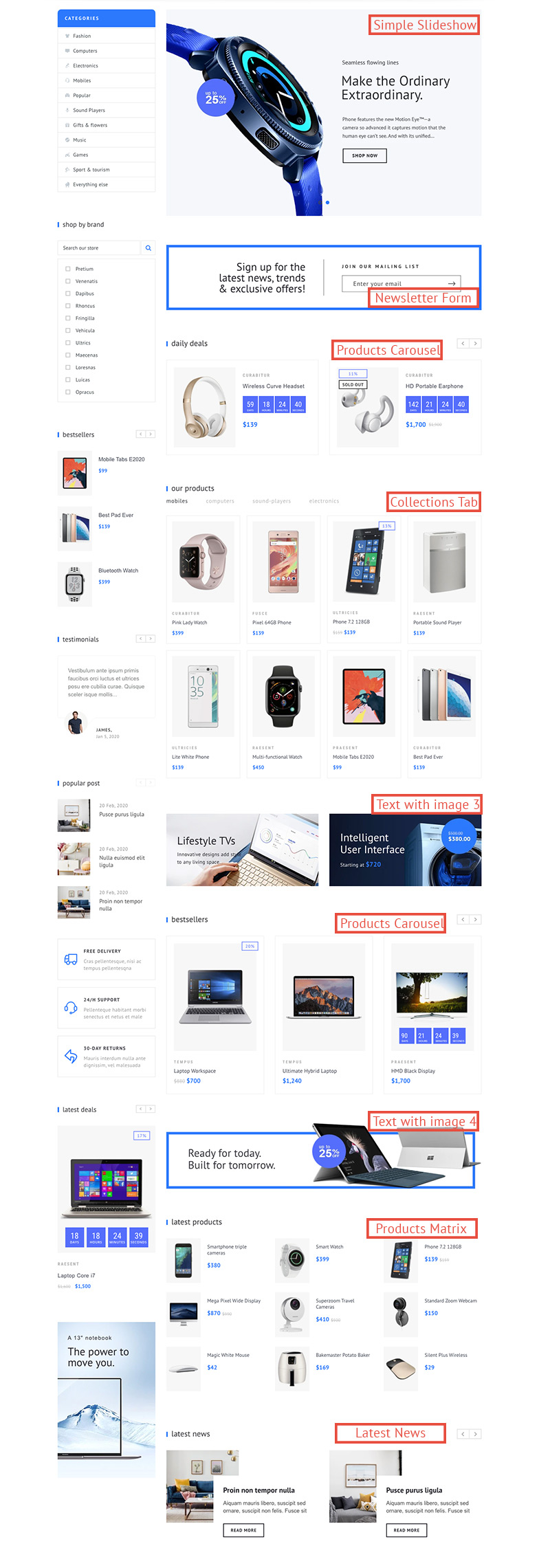
Dynamic Blocks
There are several kinds of available blocks in this section. You can add or remove them one by one as well as change their order.
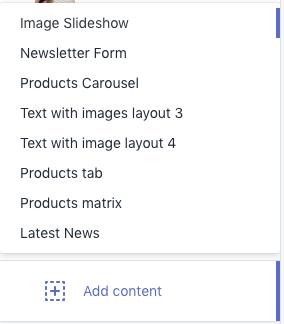
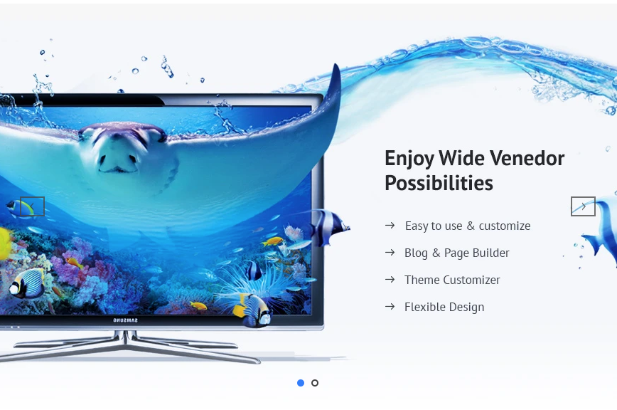
Image Slideshow
Simple slideshow with only images and link. No text content inside.
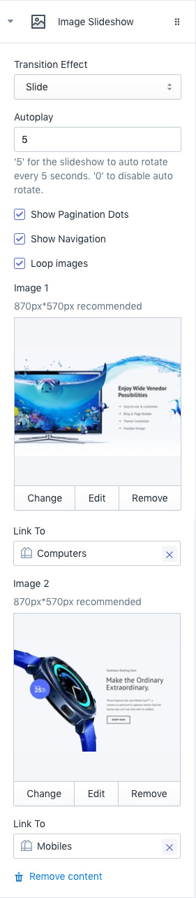
- Transition Effect: Choose effect of slide transition ( slide effect and fade effect ).
- Autoplay: Set auto rotate speed of carousel. Input 6 to autoplay every 6 seconds. Input 0 to disable autoplay.
- Show Pagination Dots: Creates and enables page dots.
- Show Navigation: Creates and enables previous & next buttons
- Loop images: Slider loops infinitely
- Image 1: First image
- Link To: Image link
- Image 2: Second image
- Link To: Image link
Newsletter Form
Simple slideshow with only images and link. No text content inside.
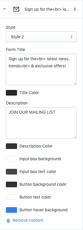
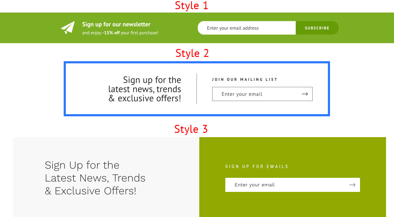
- Style: Newsletter form styles
- Form Title: Set form title.
- Title Color: Set form title color.
- Description: Set description
- Description Color: Set description color
- Input box background: Set background color of input box
- Button background color: Set background color of submit button
- Button text color: Set text color of submit button
- Button hover background: Set hover background color of submit button
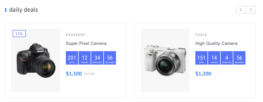
Products Carousel
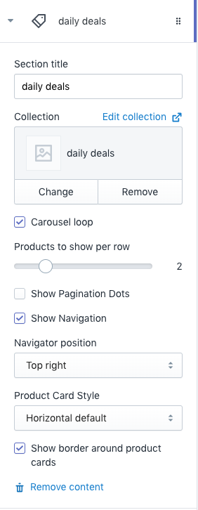
- Section title: Set title of this section
- Collection: Select collection to show.
- Carousel loop: Carousel loops infinitely
- Products to show per row: Number of products to show in one slide
- Show Pagination Dots: Creates and enables page dots.
- Show Navigation: Creates and enables previous & next buttons
- Navigator position: Set position of navigator. See navigator position styles here.
- Product Card Style: Set product card style. Browse card styles here.
- Show border around product cards: Add border to product card
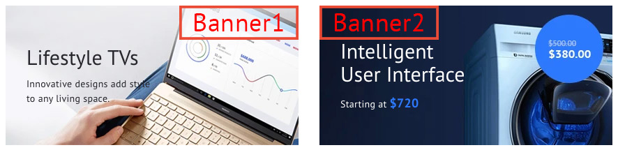
Text image layout 3
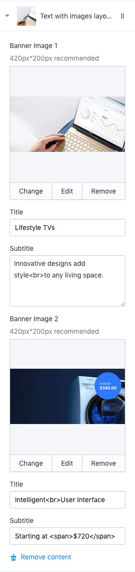
- Banner Image 1: Set first banner image. Recommended image size is 420 X 200px.
- Title: Set first banner title
- Subtitle: Set first banner sub title
- Banner Image 2: Set second banner image. Recommended image size is 420 X 200px.
- Title: Set second banner title
- Subtitle: Set second banner sub title
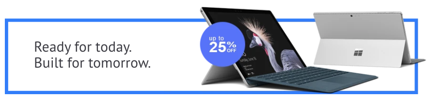
Text image layout 4
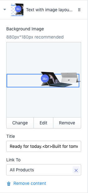
- Background Image: Set background image of the section. Recommended image size is 880 X 180px.
- Title: Set title of the section
- Link To: Set link of the section when customers click.
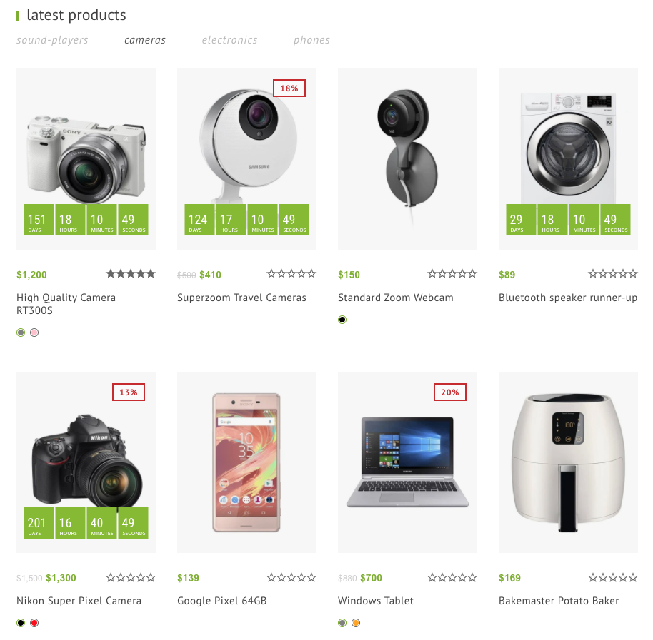
Collections Tab
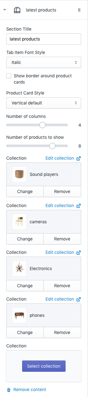
You can add collections up to 5.
- Section Title: Set title of this block.
- Tab Item Font Style: Set font style of collections title
- Show border around product cards: Add border style to product cards
- Product Card Style: Set product card style. Browse card styles here.
- Number of columns: Number of product columns
- Number of products to show: Number of product rows.
- Collection 1 ~ 5: Select collections to add as tab.
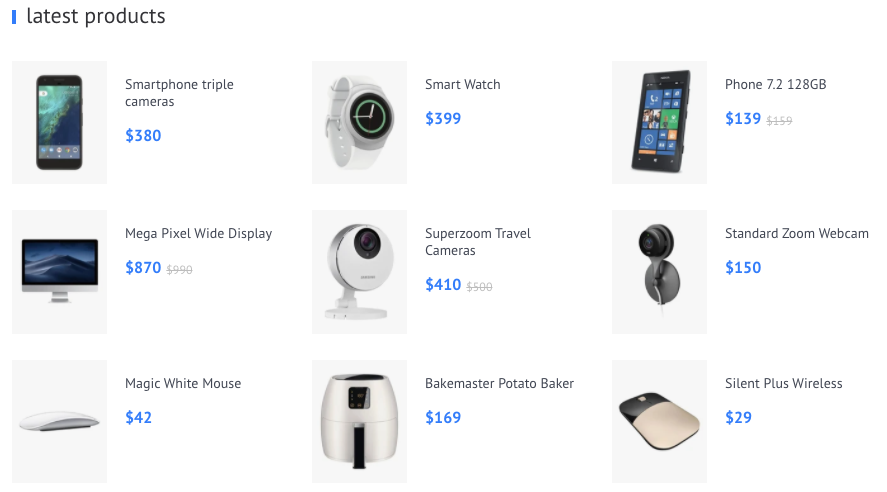
Products matrix
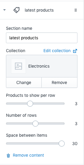
- Section name: Set section name
- Collection: Set collection to show in this section
- Products to show per row: Number of product columns. That means number of products to show in one row.
- Number of rows: Set number of rows.
- Space between items: Set space between product items. Unit is pixel
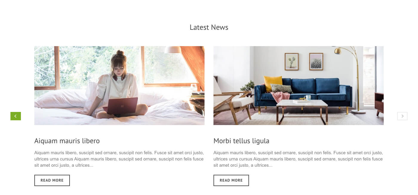
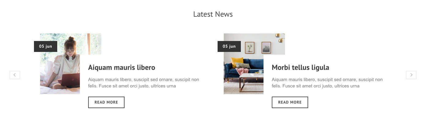
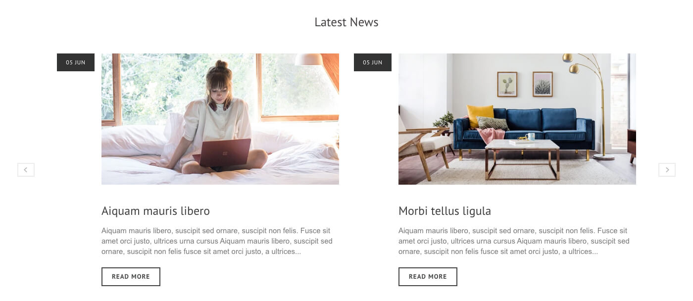
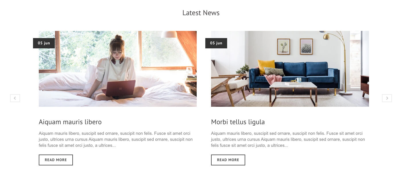
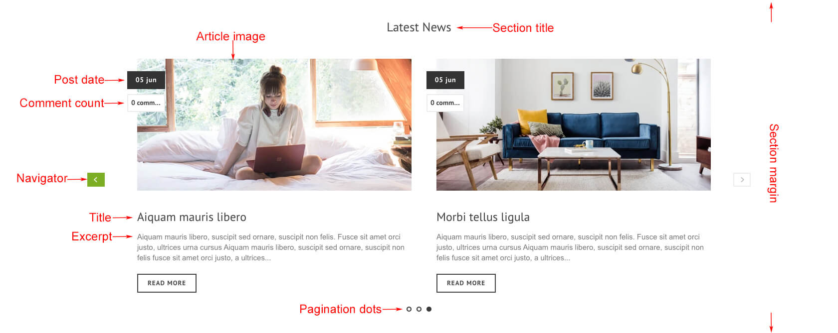
Latest News
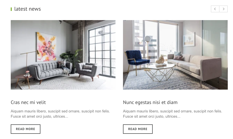
- Section title: Set title of this section
- Collection: Select collection to show.
- Carousel loop: Carousel loops infinitely
- Products to show per row: Number of products to show in one slide
- Show Pagination Dots: Creates and enables page dots.
- Show Navigation: Creates and enables previous & next buttons
- Navigator position: Set position of navigator. See navigator position styles here.
- Product Card Style: Set product card style. Browse card styles here.
- Show border around product cards: Add border to product card
- Banner Image 1: Set first banner image. Recommended image size is 420 X 200px.
- Title: Set first banner title
- Subtitle: Set first banner sub title
- Banner Image 2: Set second banner image. Recommended image size is 420 X 200px.
- Title: Set second banner title
- Subtitle: Set second banner sub title
Text image layout 4
- Background Image: Set background image of the section. Recommended image size is 880 X 180px.
- Title: Set title of the section
- Link To: Set link of the section when customers click.
Collections Tab
You can add collections up to 5.
- Section Title: Set title of this block.
- Tab Item Font Style: Set font style of collections title
- Show border around product cards: Add border style to product cards
- Product Card Style: Set product card style. Browse card styles here.
- Number of columns: Number of product columns
- Number of products to show: Number of product rows.
- Collection 1 ~ 5: Select collections to add as tab.
Products matrix
- Section name: Set section name
- Collection: Set collection to show in this section
- Products to show per row: Number of product columns. That means number of products to show in one row.
- Number of rows: Set number of rows.
- Space between items: Set space between product items. Unit is pixel
Latest News
- Background Image: Set background image of the section. Recommended image size is 880 X 180px.
- Title: Set title of the section
- Link To: Set link of the section when customers click.
You can add collections up to 5.
- Section Title: Set title of this block.
- Tab Item Font Style: Set font style of collections title
- Show border around product cards: Add border style to product cards
- Product Card Style: Set product card style. Browse card styles here.
- Number of columns: Number of product columns
- Number of products to show: Number of product rows.
- Collection 1 ~ 5: Select collections to add as tab.
Products matrix
- Section name: Set section name
- Collection: Set collection to show in this section
- Products to show per row: Number of product columns. That means number of products to show in one row.
- Number of rows: Set number of rows.
- Space between items: Set space between product items. Unit is pixel
Latest News
- Section name: Set section name
- Collection: Set collection to show in this section
- Products to show per row: Number of product columns. That means number of products to show in one row.
- Number of rows: Set number of rows.
- Space between items: Set space between product items. Unit is pixel
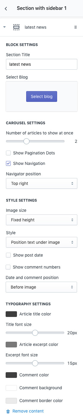
| BLOCK SETTINGS | |
|---|---|
| Section Title | Set title of this block. |
| Select Blog | Choose one of the blogs you are going to show in this section. |
| CAROUSEL SETTINGS | |
|---|---|
| Number of articles to show at once | Number of articles to show in one slide |
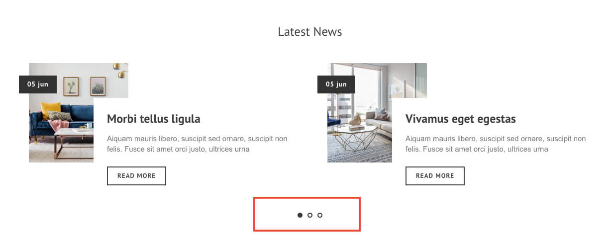
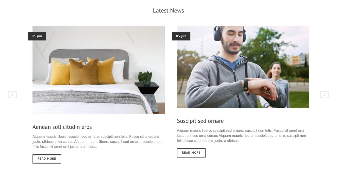
| Show Pagination Dots | View Examples Creates and enables page dots. |
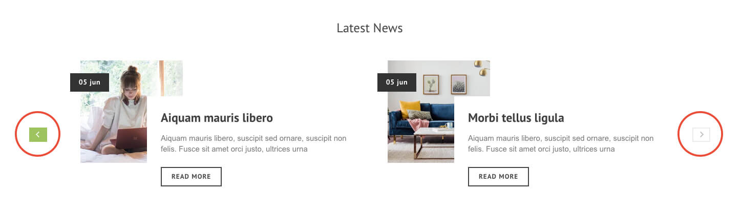
| Show Navigation | View Examples Creates and enables previous & next buttons |
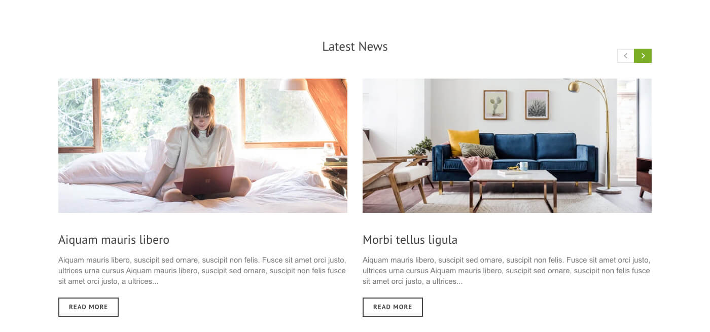
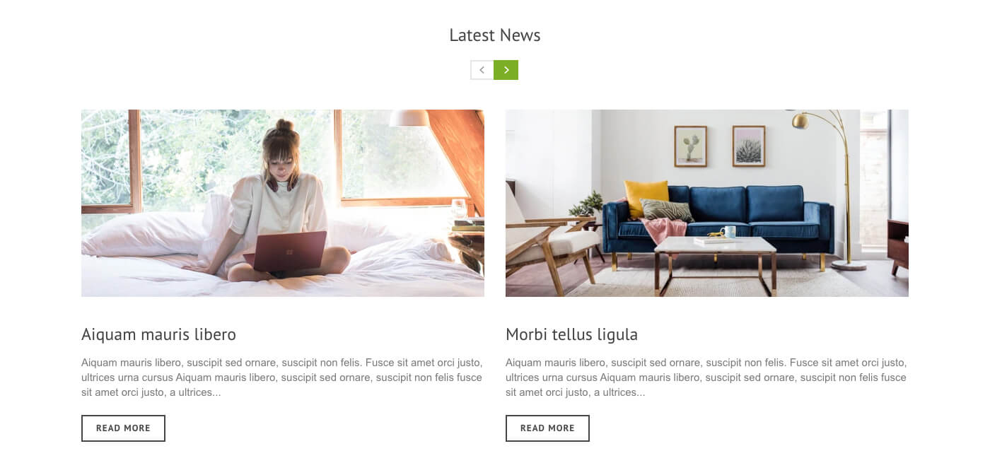
| Navigator position |
View Examples
Set position of navigator.
|
| STYLE SETTINGS | |
|---|---|
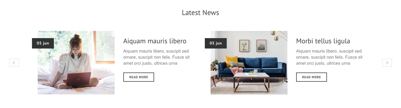
| Image size |
View Examples
Set preferred image size.
|
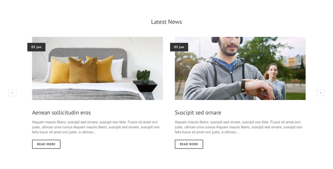
| Image and text position | Set layout of image and text.
View Examples
|
| Show post date | Shows article post date |
| Show comment numbers | Shows total number of comments of the articles |
| Date and comment position | Set position of the date/comment
View Examples
|
| TYPOGRAPHY SETTINGS | |
|---|---|
| Article Title color | Set color of article title |
| Title font size | Select title font size |
| Article excerpt color | Set color of article excerpt |
| Excerpt font size | Select excerpt font size |
| Comment color | Set comments number text color. |
| Comment background | Set background color of comments number. |
| Comment border color | Set border color of comments number. |