Venedor Section - Text and image tiles
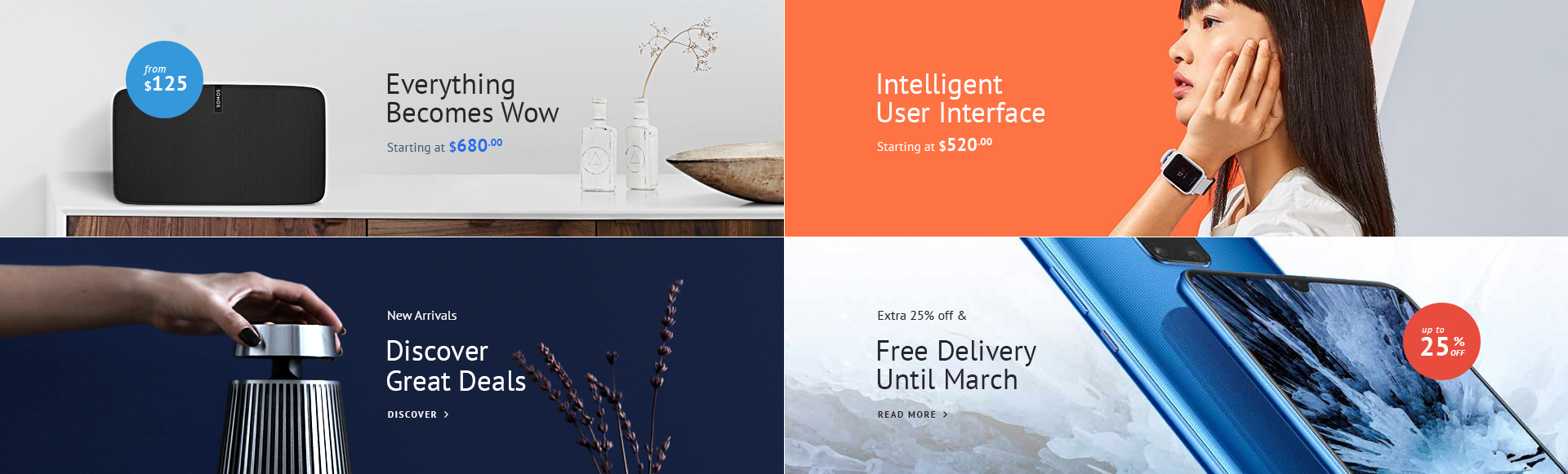
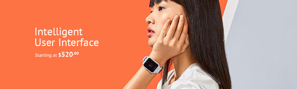
Section example 1
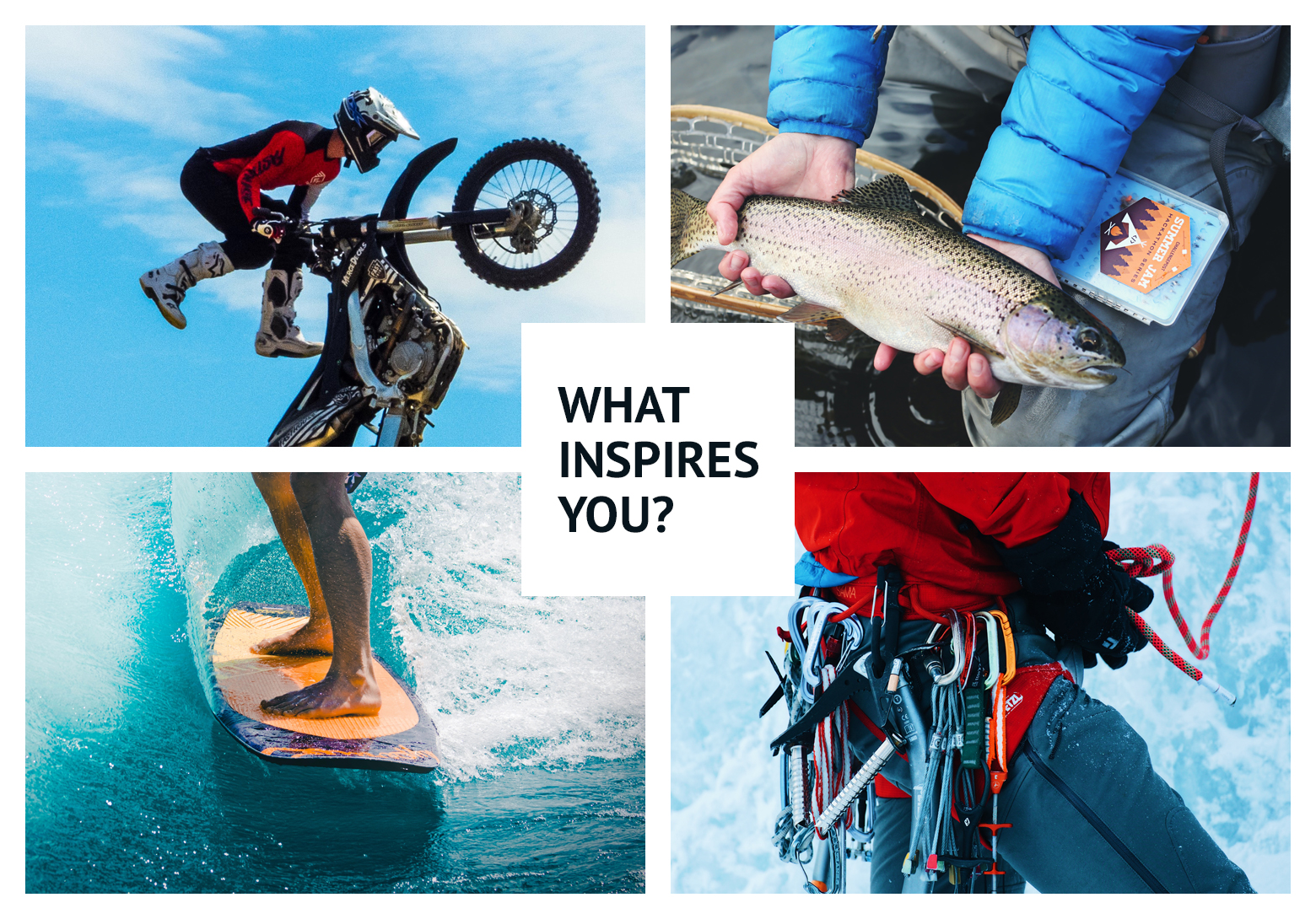
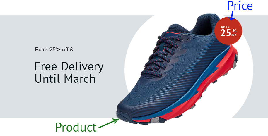
Section example 2
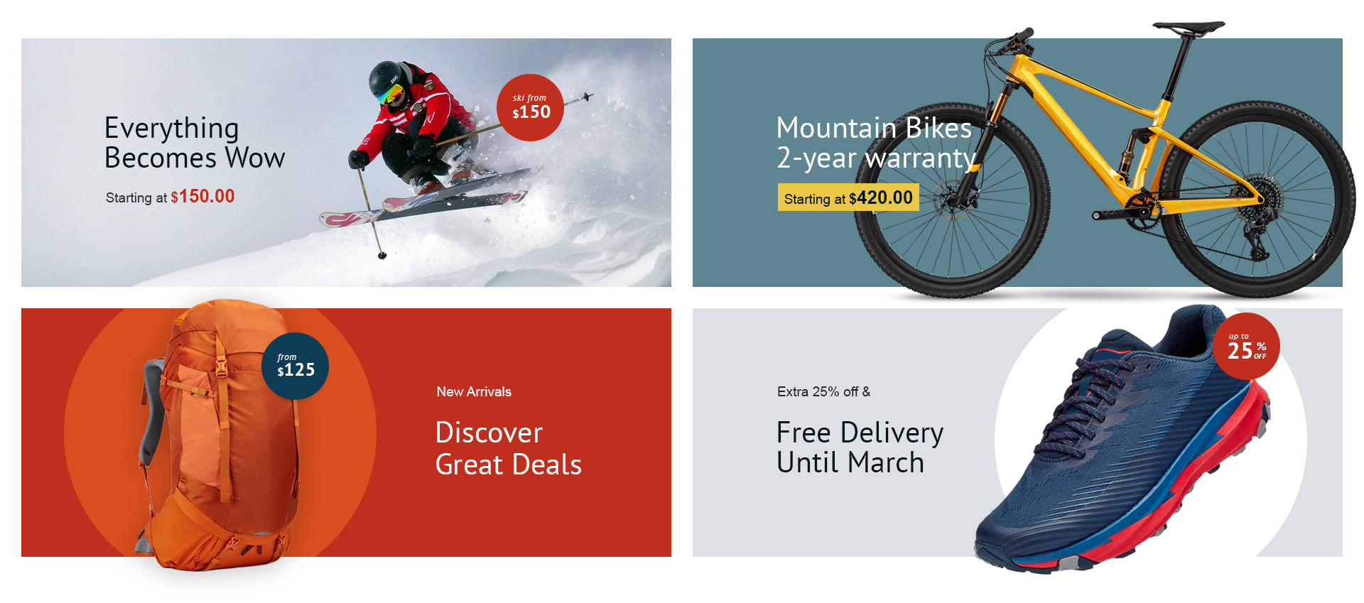
Section example 3
Section settings
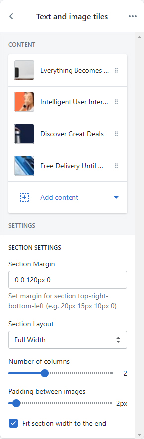
| SECTION SETTINGS | |
|---|---|
| Section Margin | Space between other sections. Order is top-right-bottom-left. |
| Section Layout | Set full width or fixed width |
| Number of columns | Set number of image columns. |
| Padding between images | Set space between images. Unit is px. |
| Fit section width to the end | Expand section width to the horizontal edges of screen |
Content settings
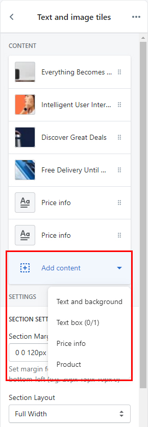
If you click Add content, you will see a number of block lists dropdown. These blocks are the contents of this section.

Text and background
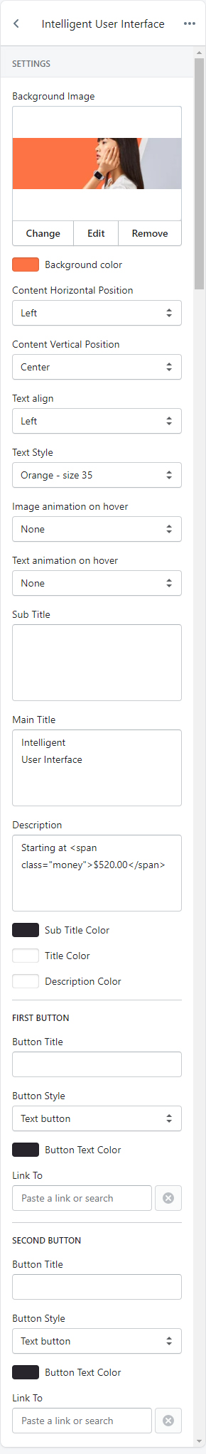
| CONTENT SETTINGS | |
|---|---|
| Background image | Set background image of the block |
| Background color | Set background color of the block |
| Content horizontal position | Set horizontal position of the text content. |
| Content vertical position | Set vertical position of the text content. |
| Text align | Set text alignment. |
| Text style | Choose one of pre-defined text styles
|
| Image animation on hover | Set effect of image when mouse hovered.
|
| Text animation on hover | Set effect of text content on mouse hover.
|
| Sub title | Set sub title of the text content. |
| Main title | Set main title of the text content. |
| Description | Set description of the text content. |
| Sub title color | Set text color of sub title. |
| Main title color | Set text color of main title. |
| Description color | Set text color of description. |
| FIRST BUTTON | |
|---|---|
| Button title | Set button title. If blank, button is hidden. |
| Button style | Set style of button defined in color settings. See configuring button colors here. |
| Button text color | Set color of the button. |
| Link to | Set button link. |
| SECOND BUTTON | |
|---|---|
| Button title | Set button title. If blank, button is hidden. |
| Button style | Set style of button defined in color settings. See configuring button colors here. |
| Button text color | Set color of the button. |
| Link to | Set button link. |
Text box
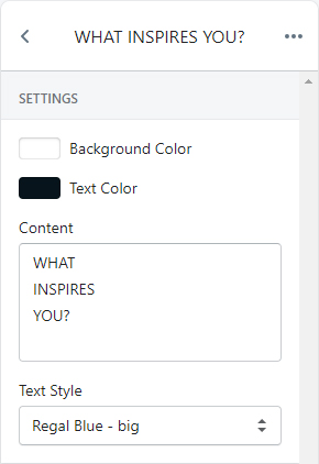
Renders a text box at the center of the block.
| CONTENT SETTINGS | |
|---|---|
| Background color | Set background color of the box |
| Text color | Set text color of the content |
| Content | Set text to show in the box |
| Text style | Choose one of pre-defined text styles
|
Price info
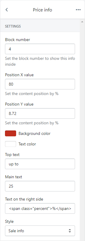
Renders a promotional styled circle inside a block.
| CONTENT SETTINGS | |
|---|---|
| Block number | Set the number of block to show this in. For example, if you want to add a sale info in the 4th image block, then set this field to 4. |
| Position X value(%) | Set X position value. Unit is percentage |
| Position Y value(%) | Set Y position value. Unit is percentage |
| Background color | Set background color of the circle |
| Text color | Set text color of the text contents |
| Top text | Set top text of the content |
| Main text | Set main text of the content |
| Text on the right side | Set a text to show on the right side of the main text
Be aware of |
| Style | Choose style of the circle content. |
Product
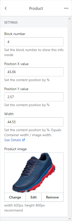
Renders an image inside a block.
| CONTENT SETTINGS | |
|---|---|
| Block number | Set the number of block to show this in. For example, if you want to add a sale info in the 4th image block, then set this field to 4. |
| Position X value(%) | Set X position value. Unit is percentage |
| Position Y value(%) | Set Y position value. Unit is percentage |
| Width | Set width of the image |
| Product image | Set product image to show inside the block. Recommended format is PNG and size is 420px * 400px. |